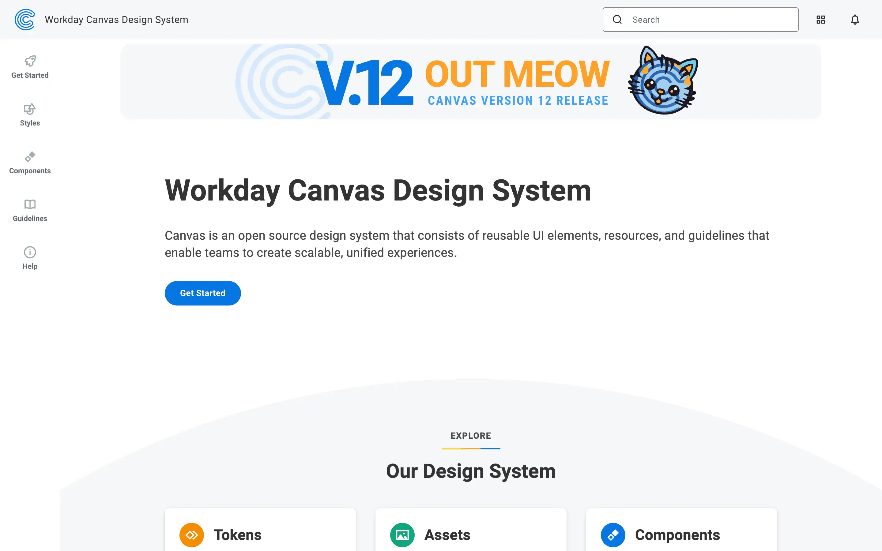
A design system and component library created to support the development of Workday’s enterprise applications. The platform provides a structured introduction for designers and developers to start building interfaces using a shared visual language, with an emphasis on consistency, accessibility, and scalability. The “Get Started” section offers guidance on foundational design principles, platform alignment, and how to begin working with Canvas tools in both design and code.
The system introduces core resources like tokens, components, layout patterns, and theming systems—alongside documentation that helps teams apply them correctly. It also encourages collaboration between design and engineering teams through shared tooling and clearly defined usage guidelines. Built with enterprise needs in mind, Canvas helps streamline cross-product experience design and ensures cohesion across Workday’s suite of software.
