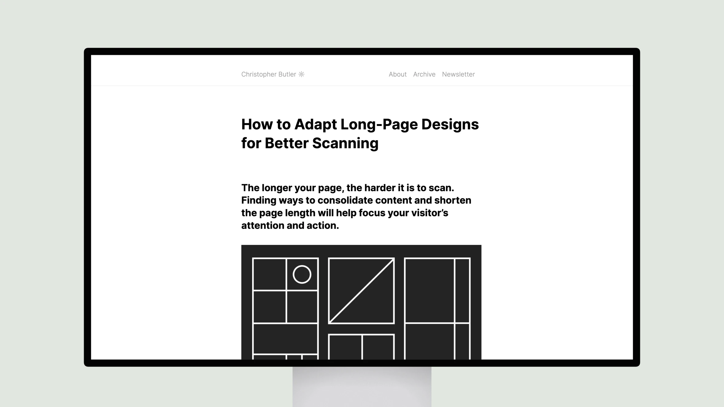
This article provides tips on how to adapt long webpage designs to be more scan-friendly. The author, Christopher Butler, argues that pages that are too long and dense are difficult for visitors to scan and understand. He then provides a 5-step process to redesign long pages:
1. Consolidate and group content to reduce length and make information easier to scan.
2. Include a summary at the top to explain what the page is about and if it’s relevant to the visitor.
3. Align key information to a single vertical axis for a consistent structure.
4. Use images and other elements perpendicular to the main axis to create “attention intersections” to draw the eye.
5. Make the primary call to action obvious from an initial scan by featuring it prominently on the page.
The case study example redesign demonstrates how to apply these principles to significantly improve scannability and comprehension of long-form web content. The overall goal is to communicate information as efficiently as possible given people’s limited attention spans.

