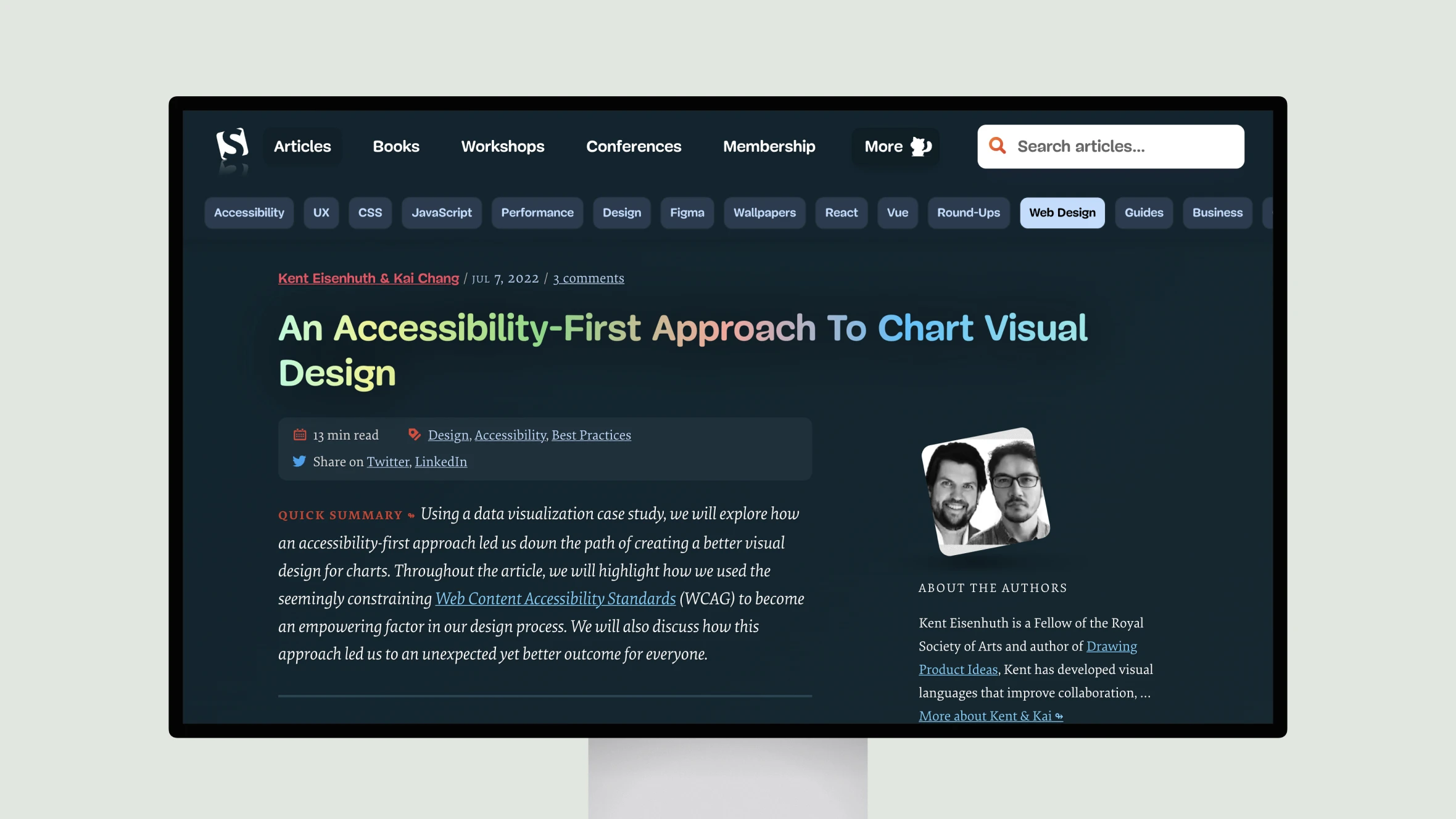
The article from Smashing Magazine explores how an accessibility-first approach to chart design led to the creation of an innovative new visualization called the “heat lane.” Written by Kent Eisenhuth and Kai Chang, both experienced data visualization designers from Google, the article takes the reader through their design process in developing this new chart type.
Starting from the goal of making app performance data accessible to low-vision and colorblind users, the authors considered chart options through the lens of the WCAG guidelines. This led them to eliminate less scalable choices like histograms and instead opt for a solution using box height, color, and additional visual elements. Through iterative testing and by coding the accessibility requirements into the very foundation of the design, they arrived at the heat lane – a hybrid of heatmap and histogram.
Eisenhuth and Chang demonstrate how their accessibility-focused process resulted in a visualization that is highly functional, flexible, and intuitively readable for all users. Not only is it fully compliant, but its design also leverages human perceptual abilities, making insights quickly graspable. The heat lane proves that an accessibility-first mindset need not come at the expense of an engaging user experience and can instead inspire new innovative solutions.

