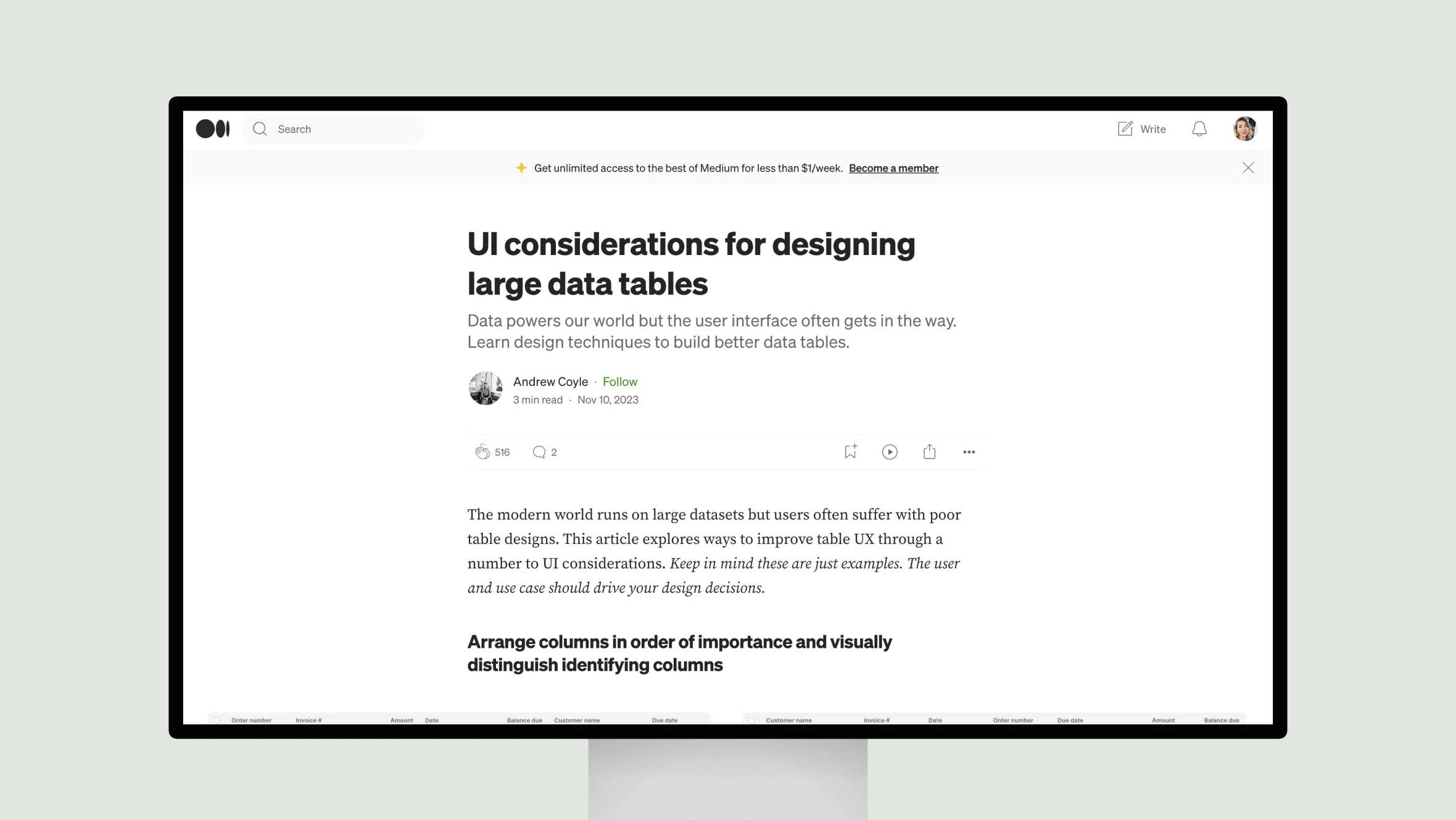
Data is at the core of many modern applications, but displaying large datasets can often lead to a poor user experience. Tables are a common way to present data, but default table designs don’t always scale well as the amount of rows and columns grows.
This article explores several UI techniques that can help make working with large data tables more user-friendly. It discusses UI patterns like column arrangement, fixed headers, filtering, and search that can improve the usability of large data tables and make working with significant datasets more efficient for users. The goal is to design interfaces that put relevant data at users’ fingertips without getting in the way of their tasks.

