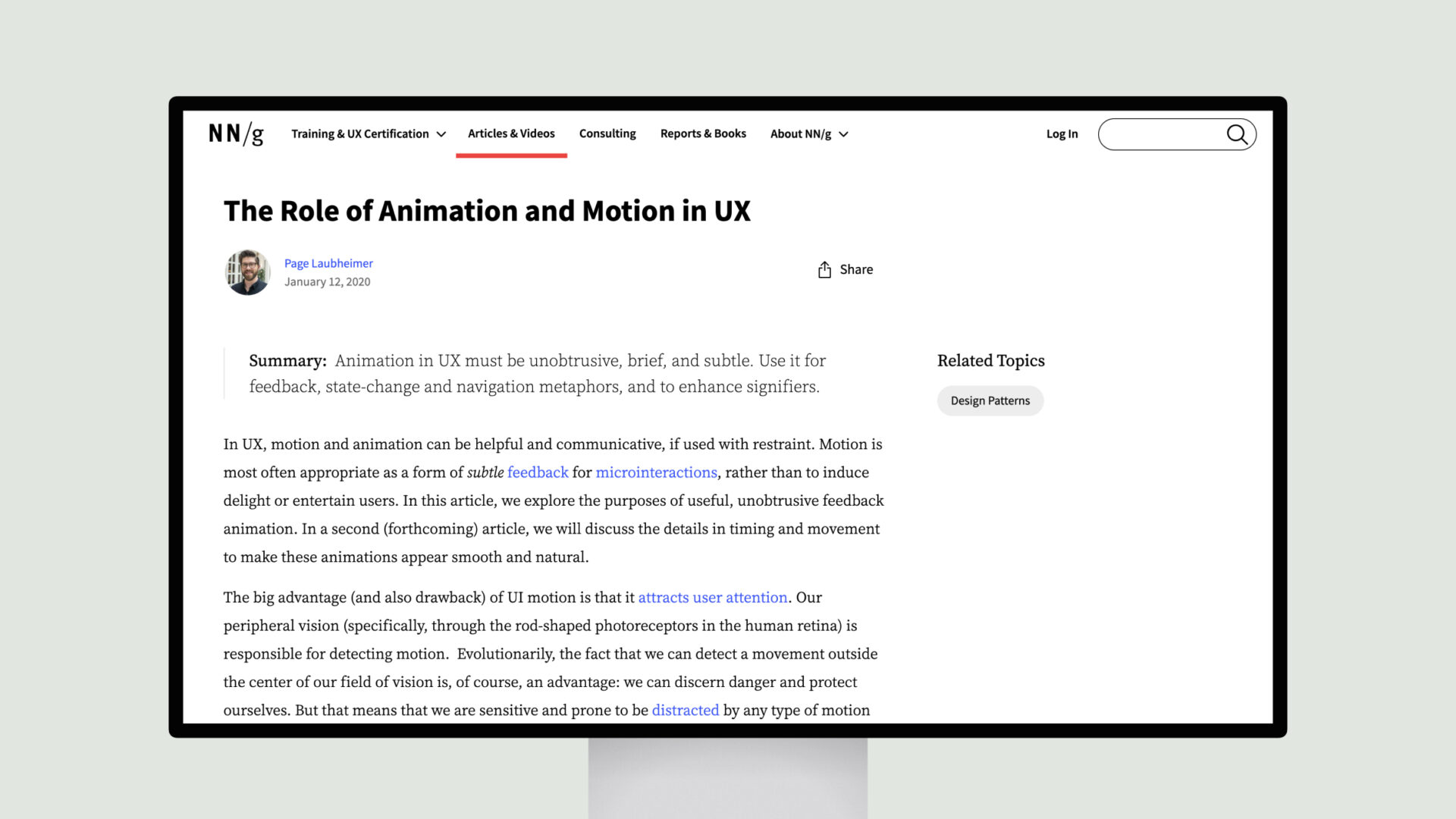
Animation and motion in user experience (UX) design can be powerful tools, but they must be used with restraint. The primary purpose of animation should be to provide subtle, unobtrusive feedback to users rather than entertain or delight them.
Motion can effectively communicate state changes, such as when a user switches between different modes or views. For example, animations that morph one icon into another can help users understand the transition. Loading indicators that use animated “skeleton screens” can also effectively signal that the system is still processing.
Additionally, animations can be leveraged to enhance spatial metaphors and navigation. Zooming in and out or sliding content across the screen can give users a better sense of their location within a complex information hierarchy. This can prevent disorientation and help users understand how to interact with various UI elements.

