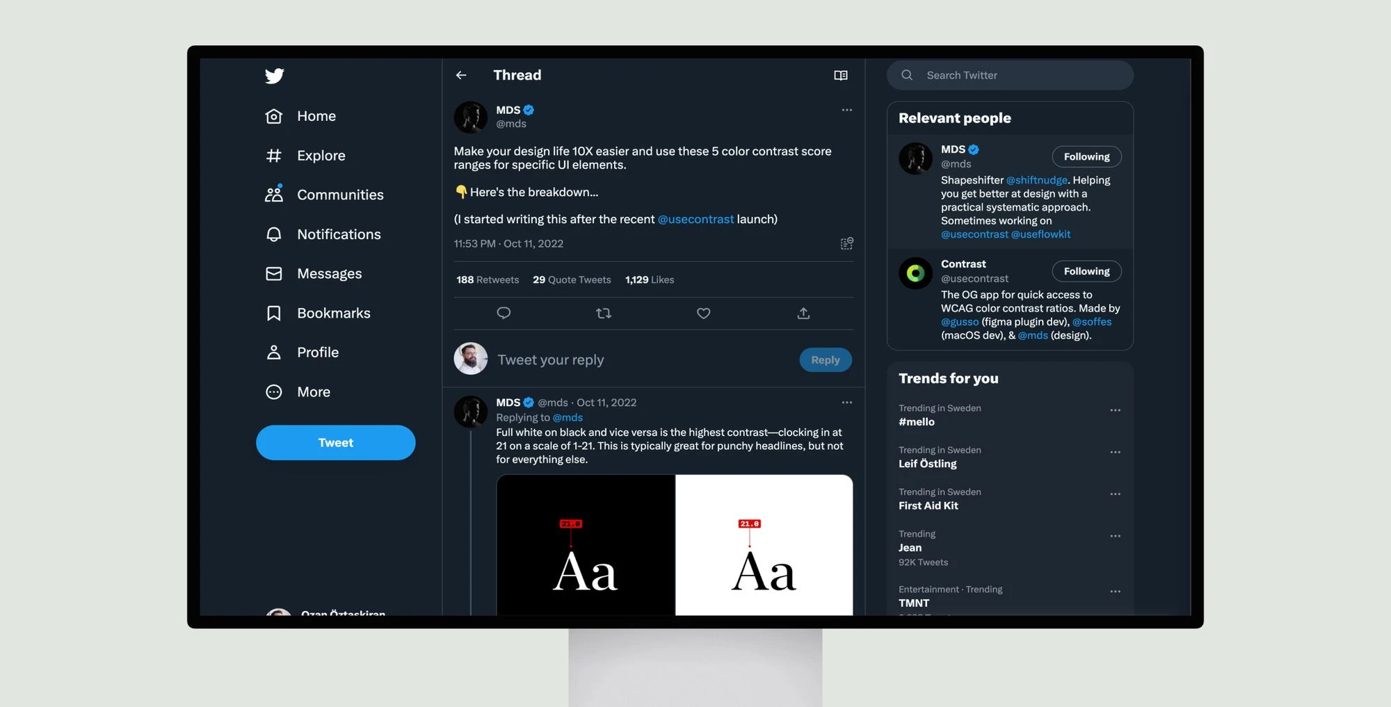
Matt D. Smith shares color contrast score ranges for specific UI elements to make design life easier. He notes AAA (3.0) requires 18px bold or 21px regular text. 4.5 is good for secondary items like tables and lists. Flat styles may mean unique design or poor color choice.
AA (4.5) works for secondary copy. Dark mode is harder due to eye sensitivity in low light. Body text on dark backgrounds scores best at 7-12. AAA is best for titles and important items, 12-21 for dark text on light backgrounds. Headlines work at full white/black contrast of 21. Light mode contrasts are subtle from 9 points versus dark mode at 5 points.


