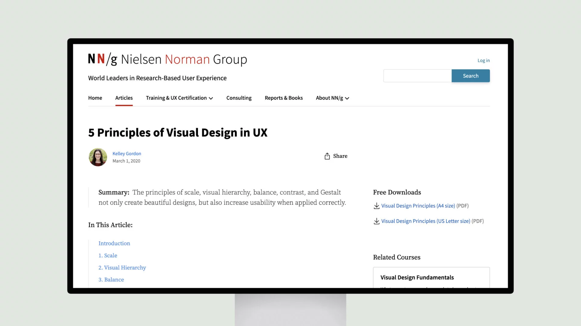
Visual design is crucial for creating engaging user experiences. Experienced designers use several principles to make interfaces appealing and usable. Scale, hierarchy, balance, and contrast help guide users’ eyes and communicate what’s most important.
Scale is about using size to direct attention – the biggest elements pop out as priorities. Hierarchy is similar, using techniques like font sizes or color to structure what you see first. Balance keeps things feeling stable, whether symmetrical or asymmetrical.
Contrast makes certain things stand out from the rest through differences in color or style. This could be things like delete buttons in red. The Gestalt principles also come into play subconsciously, like how proximity makes related items feel grouped together.
When these visual rules are followed, users feel good, and tasks become intuitive. This strengthens the brand and builds trust. While looking nice is great, the main benefit is improving usability. An attractive interface just feels better to use!
The principles have been refined over decades of research and design experience. Even if you’re not an artist, understanding them can help anyone create enjoyable interfaces.


