The article discusses 7 principles for designing high-quality icon families: clarity, readability, alignment, brevity, consistency, personality, and ease of use. For each principle, the author Helena Zhang provides examples from existing icon sets like Apple, Google Maps, and Material Design icons to illustrate best practices.
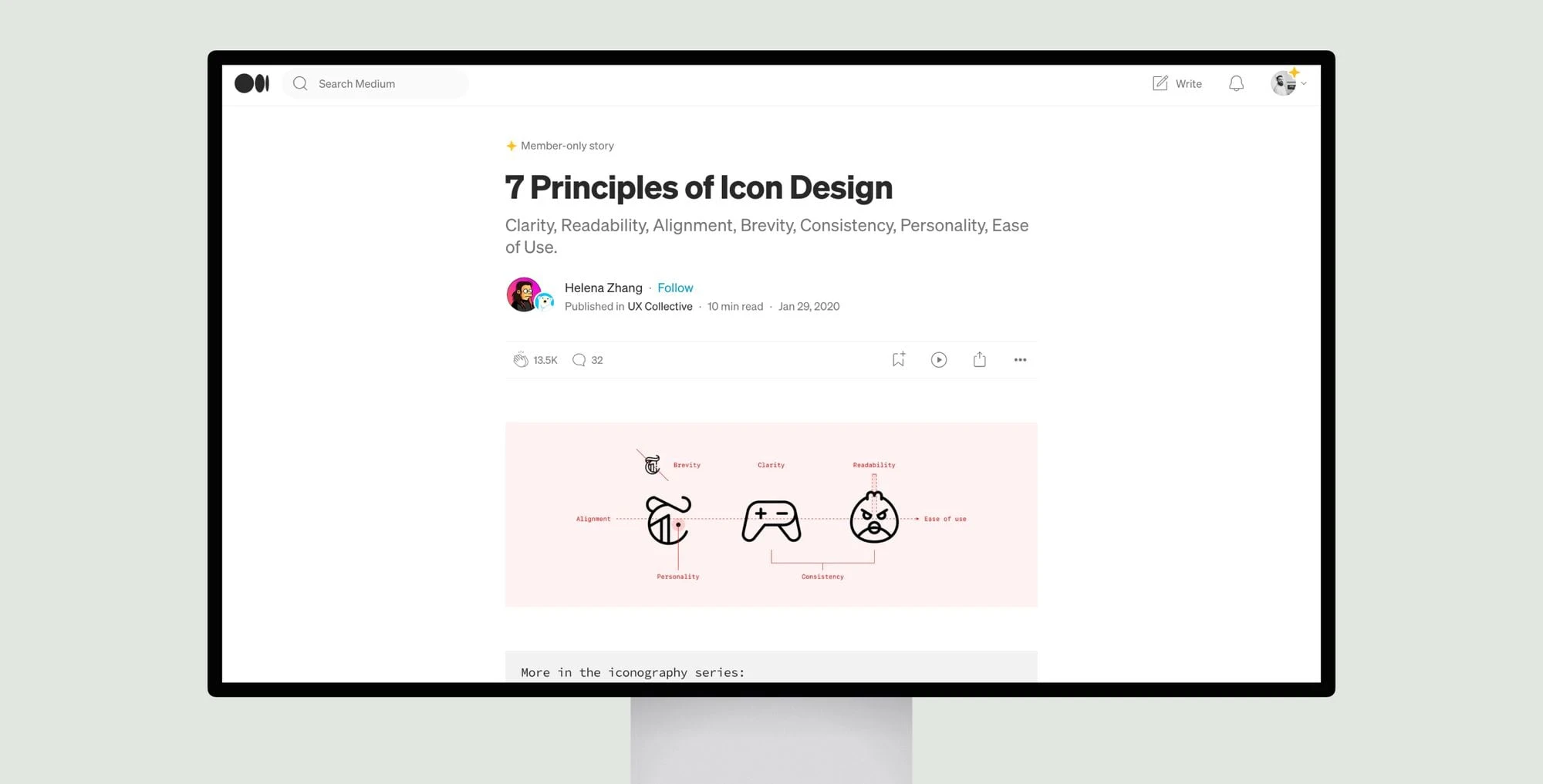
Clarity means icons should communicate their meaning intuitively without needing additional context. Readability involves ensuring fine details are distinguishable at small sizes. Alignment refers to optically balancing icon elements. Brevity is about expressing concepts succinctly using minimal details. Consistency involves maintaining uniform stylistic rules across an icon set. Personality refers to an icon set having a distinctive flavor that reflects a brand. Ease of use involves organizing, documenting, testing and potentially developing custom tools to facilitate using the icons.
Overall, the article gives practical guidance to icon designers on how to develop icons that are understandable, cohesive as a set, and usable in real-world applications. The examples showcase both successes and failures, while the principles distill best practices derived from analyzing existing icon libraries. It would be a useful resource for any designer seeking to develop high-quality icons.


