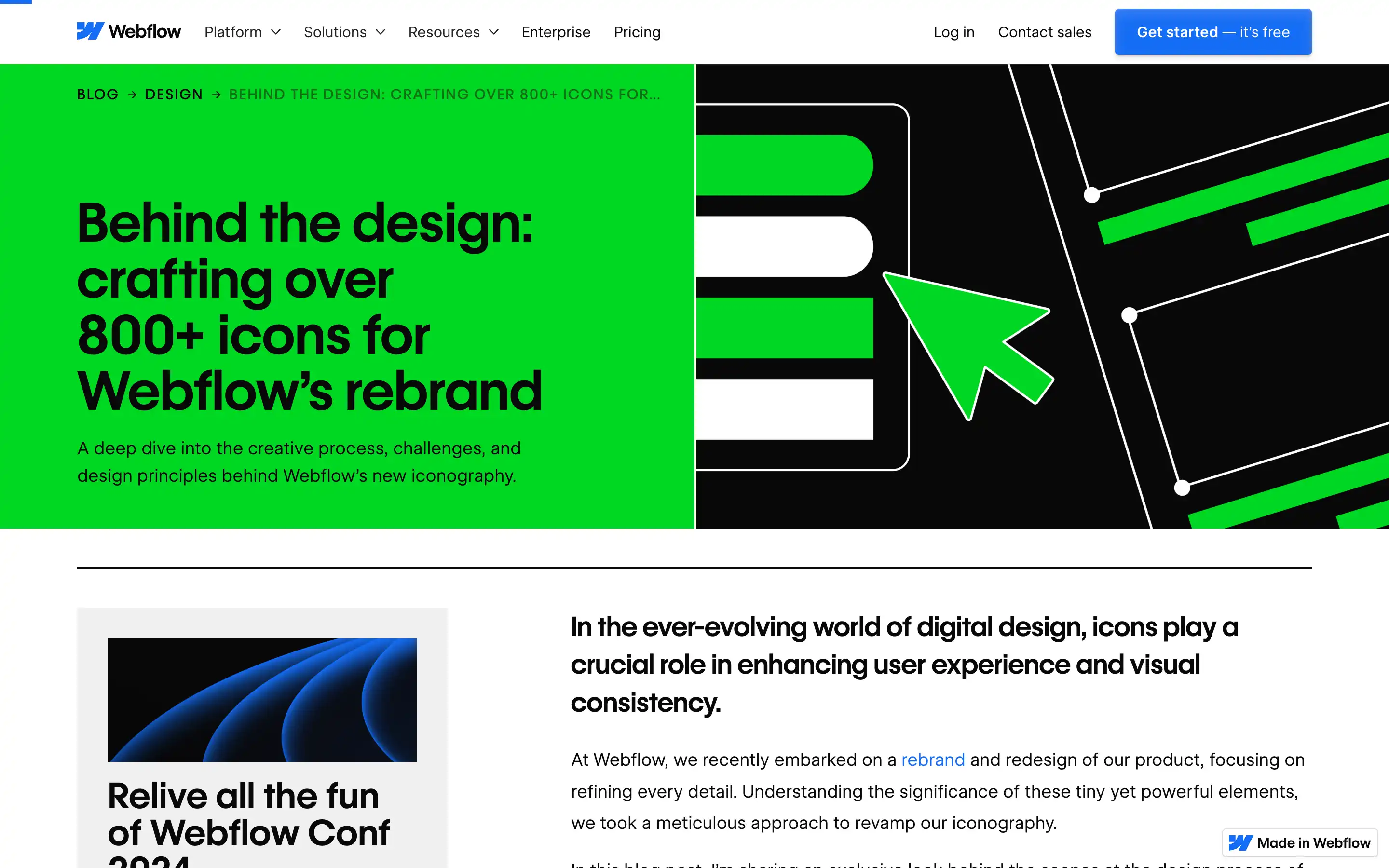
Hüseyin Gayiran offers a detailed behind-the-scenes look at how Webflow’s extensive icon set was created to support the brand’s visual identity. He shares insights into the thoughtful design process, the challenges faced, and the principles that guided the work, ensuring the icons perfectly align with both the brand’s aesthetic and practical needs. The focus on consistency, scalability, and clarity makes this a valuable read for anyone tackling complex icon design projects.
In recounting the journey of designing over 800 icons, Gayiran highlights the careful balance between creativity and sticking to brand guidelines. This article provides practical advice and inspiration for designers, illustrating how well-crafted iconography can elevate user experience while reinforcing a cohesive and recognizable brand identity.
