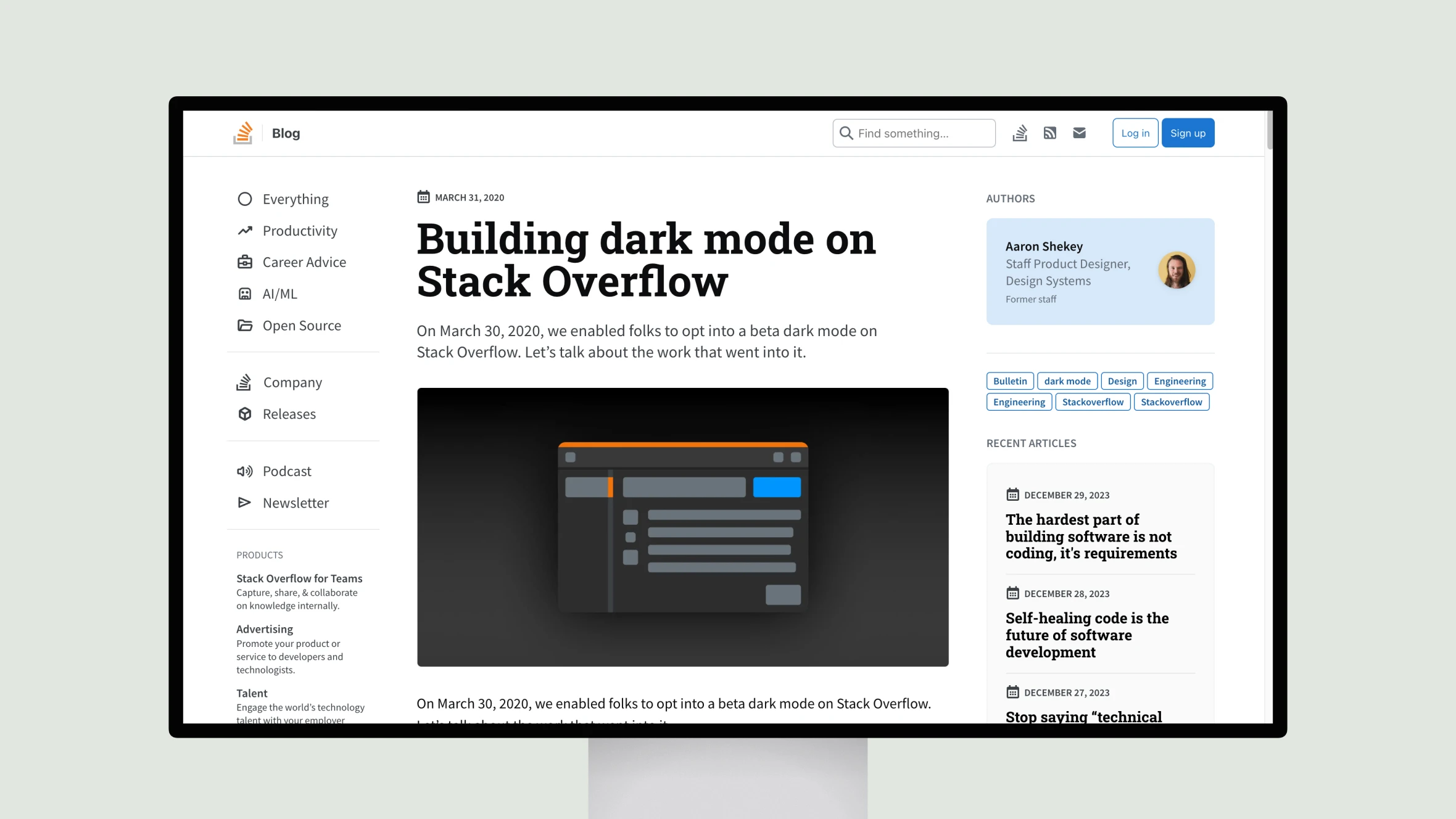
Aaron Shekey, Principal Product Designer at Stack Overflow, outlines the thoughtful process behind bringing a dark mode to their popular Q&A platform. Shekey discusses how they modernized the front-end codebase and enabled accessibility-conscious theming through a systematic redesign of their color palette and component library.
By first hand-designing color scales and normalizing values, Shekey ensured high contrast and usability across light and dark backgrounds. He then translated static colors to CSS variables for flexibility while maintaining backwards compatibility. Refactoring components like buttons, tags and headers involved strategic decoupling from legacy styles.
The challenges of adapting existing codebases are candidly described, such as untangling complex style dependencies and incremental rollouts. Shekey’s emphasis on designing systemically sets the stage for future accessibility features. Through diligent planning and collaboration across teams, Stack Overflow now offers their large community of developers an optimized experience in dark or light mode. This impactful work highlights the importance of user-centered design principles for inclusive product experiences.


