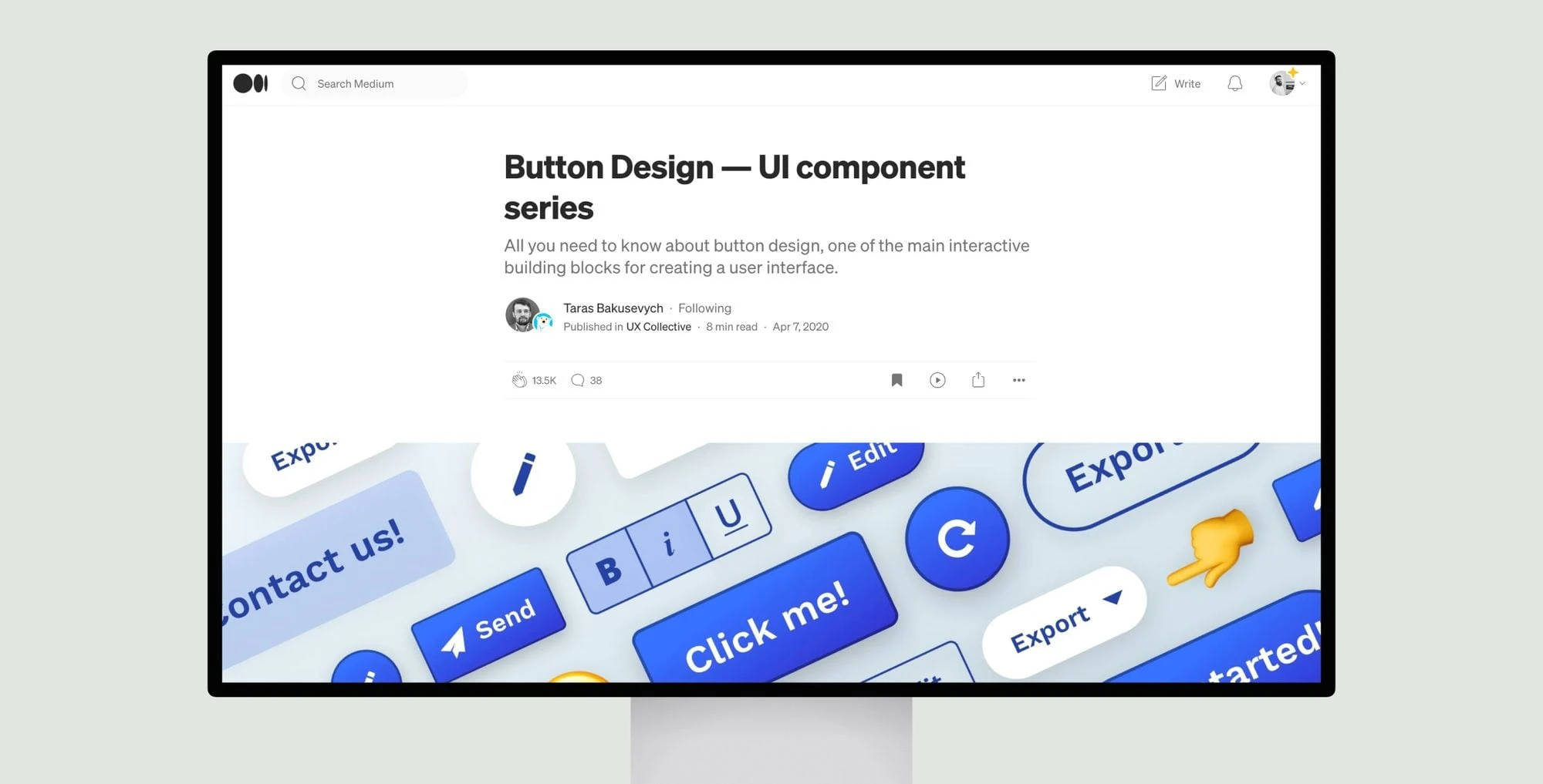
This in-depth guide explores the essentials of effective button design. Buttons are one of the primary interactive elements in any user interface, so getting their design right is crucial. The article examines best practices for button styles, states, sizes, labels and more to ensure intuitive, accessible interactions.
Key recommendations include using different styles to distinguish primary actions from secondary ones; clearly indicating status through hover, focus and active states; ensuring touch targets are large enough for reliable taps; and crafting clear, action-oriented labels. Accessibility is also addressed through proper sizing, color contrast and screen reader support.
Overall, the goal is to design buttons that invite users to take action in a predictable, frustration-free manner, allowing them to achieve their goals seamlessly through well-designed interactive elements.
Button Design — UI component series
“Button Design — UI component series” covers best practices for button design, focusing on styles, sizes, accessibility, and clear, action-oriented labels.
Topic(s):
Added on:
UI & UX design inspiration for mobile & web apps.


