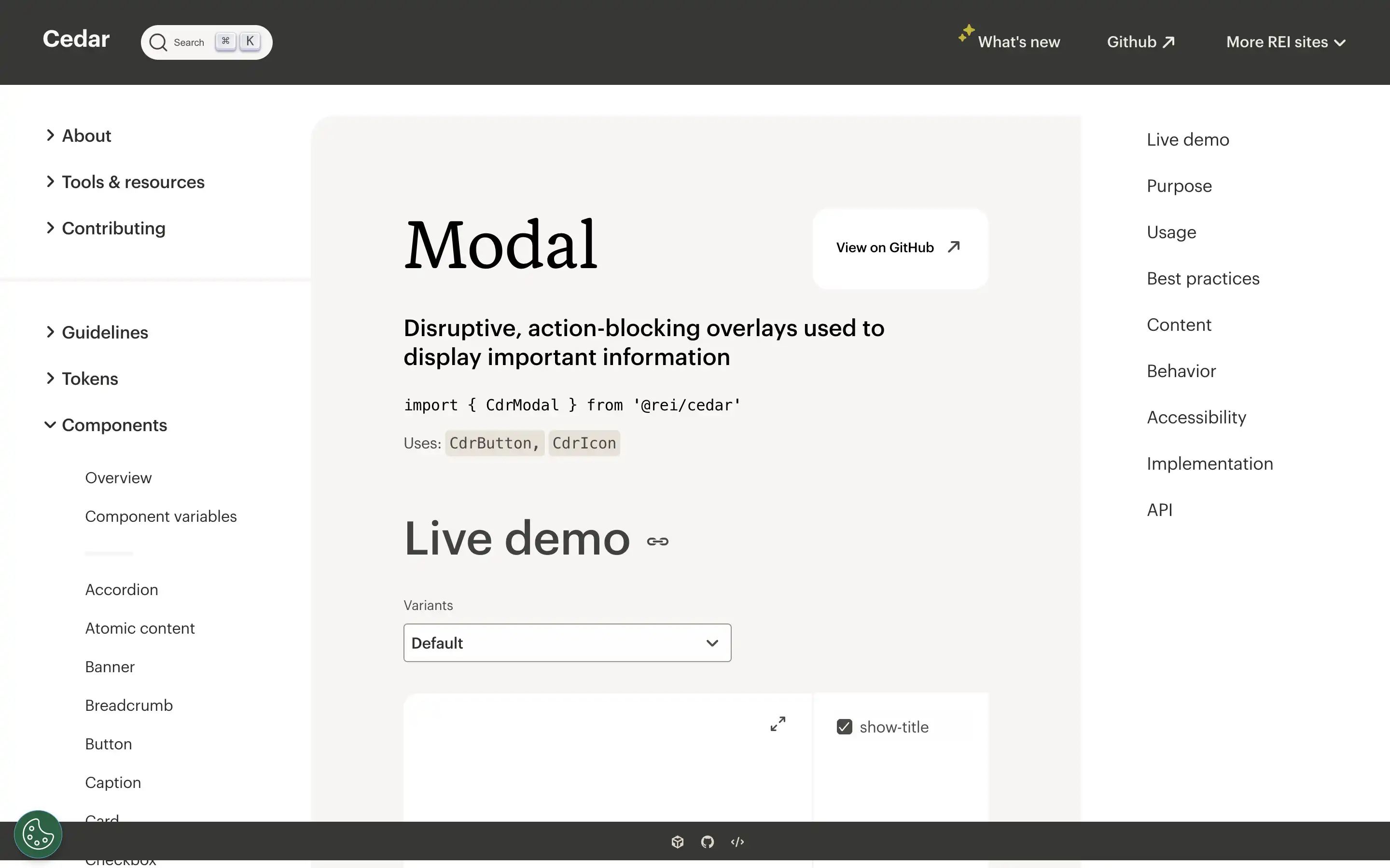
The Cedar Design System from REI Co-op provides comprehensive guidelines and components for building modern, accessible web experiences. The modal component is a key part of this system, designed to display important information and require user attention.
Modals are disruptive by nature, blocking the user’s current task so that they can focus on the modal content. As such, the guidelines emphasize using modals sparingly and only for critical information or tasks. Modals should have clear, concise titles, and the content should not exceed 560 characters.
Overall, the Cedar Design System’s modal component provides a well-designed, accessible solution for displaying important content and interactions while emphasizing best practices to ensure a seamless user experience.


