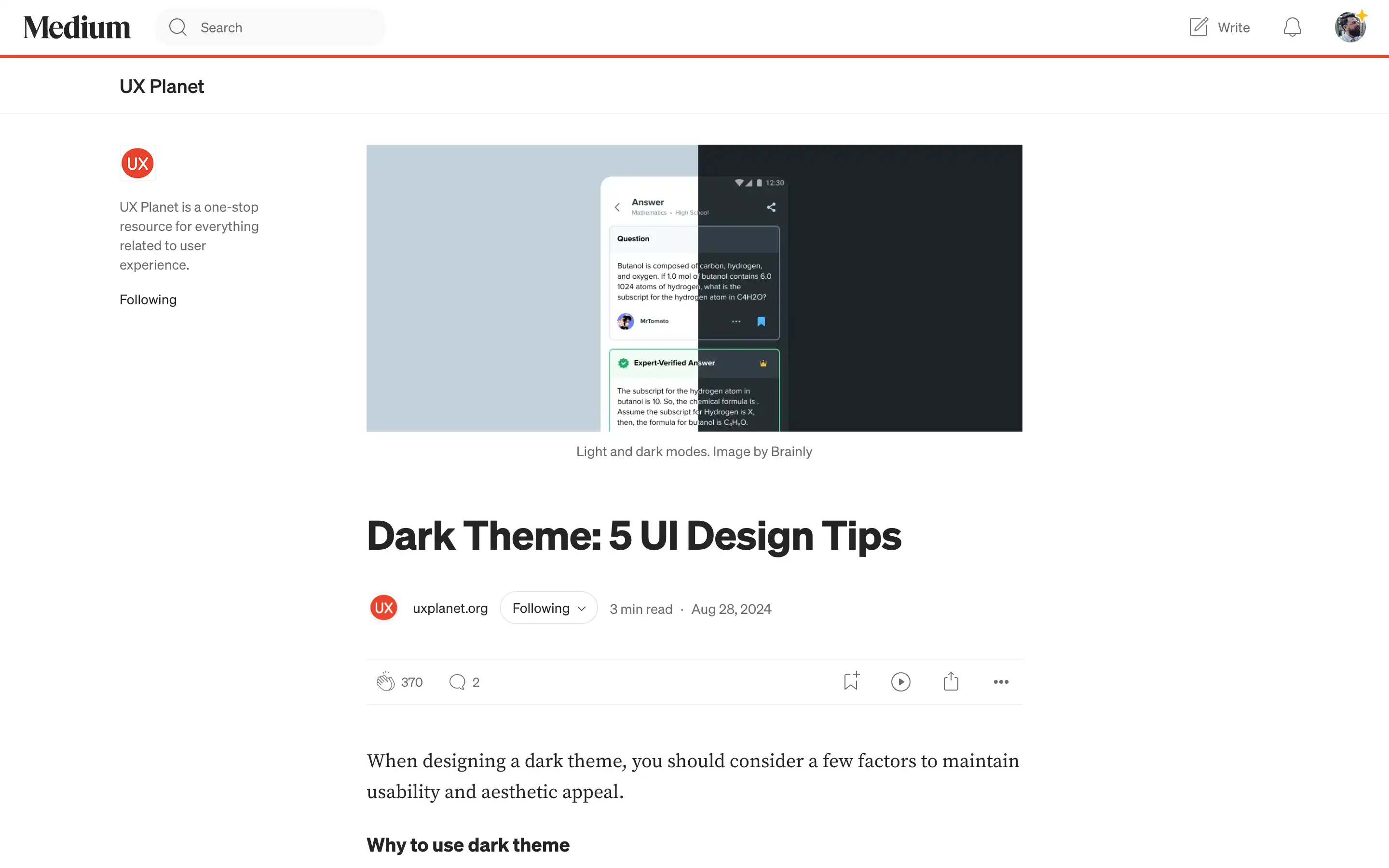
When designing a dark theme for your user interface, UX Planet has outlined several key factors to consider to maintain usability and aesthetic appeal. Firstly, UX Planet advises avoiding the use of pure black (#000000) as a background color, as it can be too harsh on the viewer’s eyes. Instead, it recommends opting for dark gray (#121212 or similar), which helps reduce eye strain and makes it easier to communicate depth in the UI.
Secondly, note that text legibility can be a challenge in dark mode, so you’ll need to choose fonts that are legible in both light and dark modes. Considering these tips mentioned in the article, you can create a dark theme that is visually appealing and highly usable for your audience.


