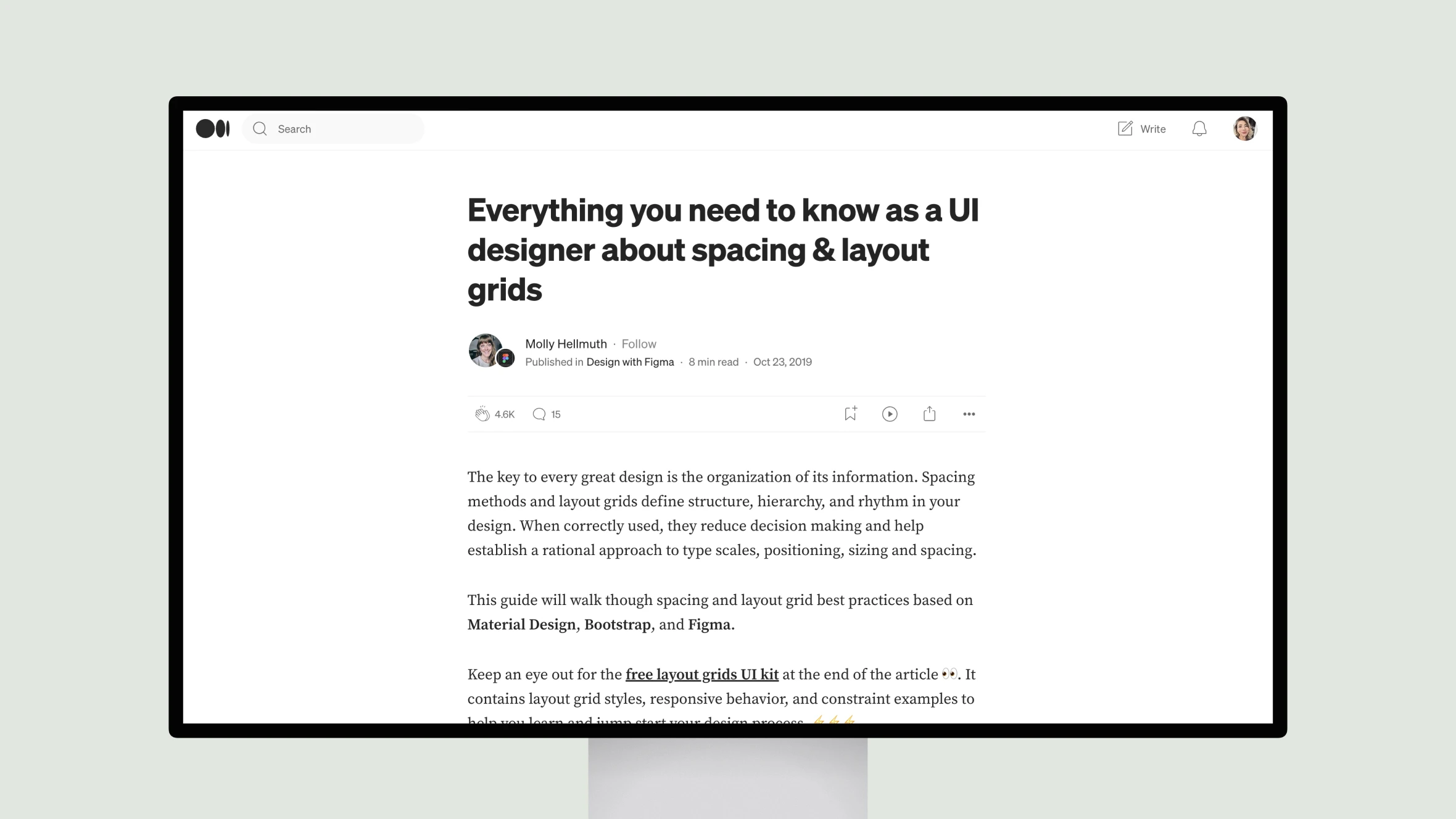
This article by UI designer Molly Hellmuth provides valuable guidance for implementing effective spacing and layout grids. As Molly explains, grids are essential for organizing information across devices in a consistent, user-friendly manner.
She begins by discussing spacing basics like establishing an 8px base unit for measurements. This promotes visual harmony and ease of development. Molly also offers tips for sizing, padding and nudging elements in Figma.
The article then dives into various grid types like column, modular and baseline grids. Molly stresses the importance of responsive grids that adapt fluidly or with fixed elements across breakpoints. She provides recommended breakpoints that are helpful for communicating designs.
In the detailed Figma section, Molly illustrates how to apply grids to frames at any level for flexible, nested designs. Constraints are also highlighted as a powerful way to maintain responsiveness. Additionally, she encourages saving grid styles and customizing appearances for clarity.
Overall, Molly’s primer is a must-read for any UI designer. Her clear explanations and visual examples ensure readers come away with a strong understanding of layout best practices. The free Figma kit she mentions is also a nice bonus for applying these guidelines efficiently.


