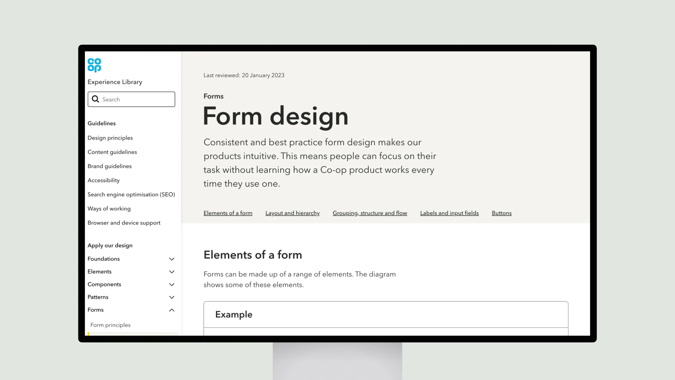
This page from the Co-op Experience Library provides guidance on best practices for designing consistent and intuitive forms. It discusses elements like layout, hierarchy, grouping and logical sequencing to help users easily understand and complete forms. Guidelines are given for labeling fields, optional vs required indicators, and using the appropriate width and spacing. Buttons should be left-aligned and clearly signify primary actions. While lengthy forms can cause issues, patterns like multi-step and progressive disclosure can help. Sticking to these principles leads to forms that are straightforward and user-focused.
Form design
The Co-op Experience Library offers best practices for designing user-friendly, intuitive forms with clear layouts, hierarchy, and logical sequencing.
Topic(s):
Added on:


