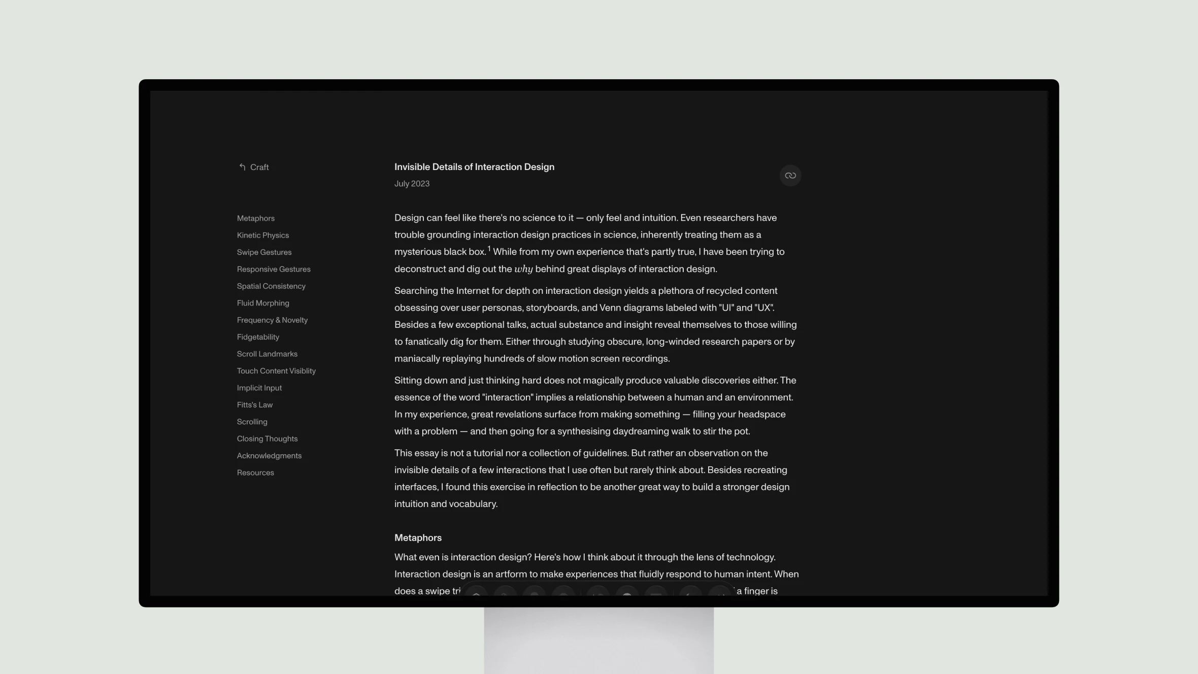
This insightful article explores the invisible details of interaction design through the lens of Rauno, an experienced designer. Rauno deconstructs common touchscreen gestures like swiping and pinching to reveal the thoughtful metaphors and physical models that make these interactions feel natural. He examines how subtle kinetic effects mimic real-world physics, and how responsive timing builds confidence in the interface.
Rauno also considers when animations should be used versus avoided. Frequent or low-novelty tasks like menus may cause fatigue, while playful details can boost enjoyment. Spatial consistency and fluid morphing maintain clarity. Landmarks and loupe effects aid precision tasks.
Overall this well-researched piece gives a fascinating look inside the invisible machinery that makes digital experiences feel like intuitive extensions of ourselves. Rauno’s analysis of nuanced case studies provides valuable lessons for any designer seeking to elevate the fluidity and responsiveness of their work.


