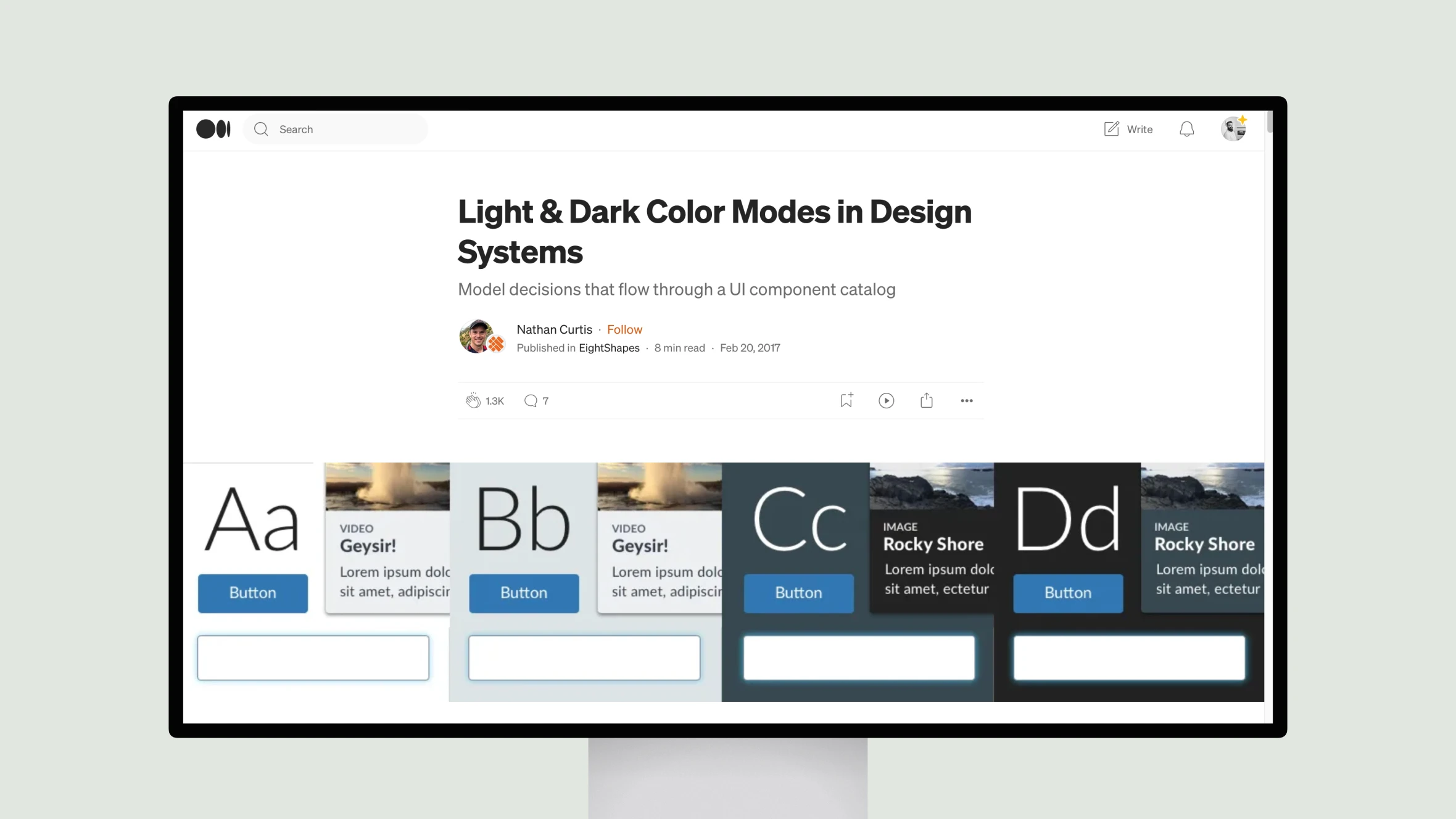
Nathan Curtis outlines several key considerations for implementing an accessible light-dark toggle.
He recommends starting by auditing existing neutrals and arranging components across backgrounds. He then discusses modeling background, text, border and state properties for light and dark. Throughout, Curtis emphasizes the importance of accessibility testing and refining the neutral palette. Tokenizing decisions and incrementally updating all components is also advised.
Overall, the article provides helpful guidance on preparing, codifying and executing a reversible color system that supports diverse viewing conditions. Curtis’ experience consulting on major design systems comes through in the practical yet thoughtful recommendations.


