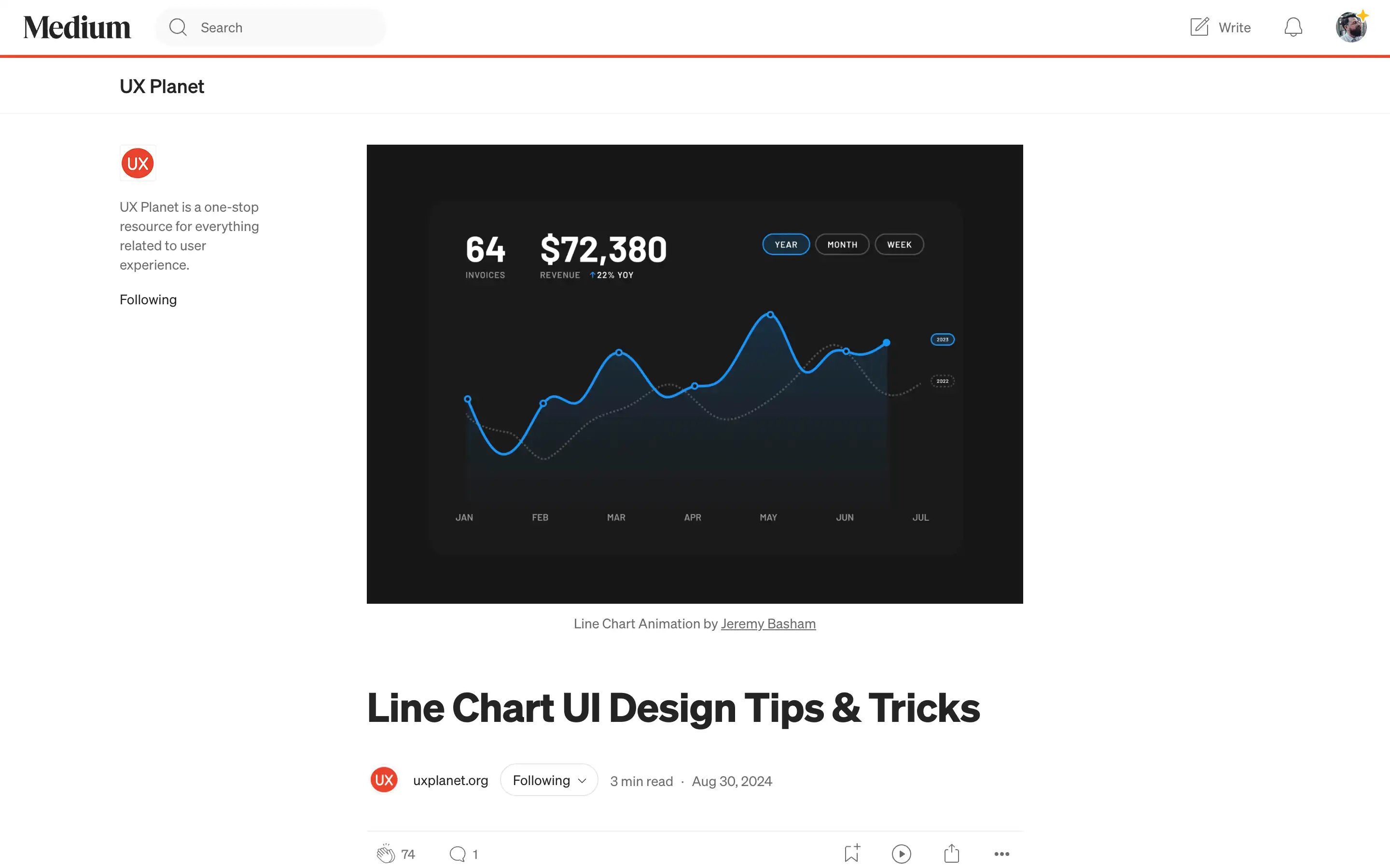
Line charts are powerful data visualization tools that can effectively communicate changes over time, comparisons, and trends. However, designers must follow certain best practices to ensure their line charts are clear, engaging, and accessible.
Firstly, the number of lines on a chart should be limited to four or fewer. Cramming too many lines onto a single chart can make it appear cluttered and difficult for users to extract meaningful insights.
Color plays a vital role in line chart design. The background should be neutral to make the lines stand out, and the line colors should be distinct and contrasting to help users differentiate between them.
Accessibility is another key consideration. The chart colors must meet the WCAG AA 3:1 contrast ratio to ensure readability for users with visual impairments. Adequate spacing should also be provided for labels to prevent overlapping and maintain clarity.


