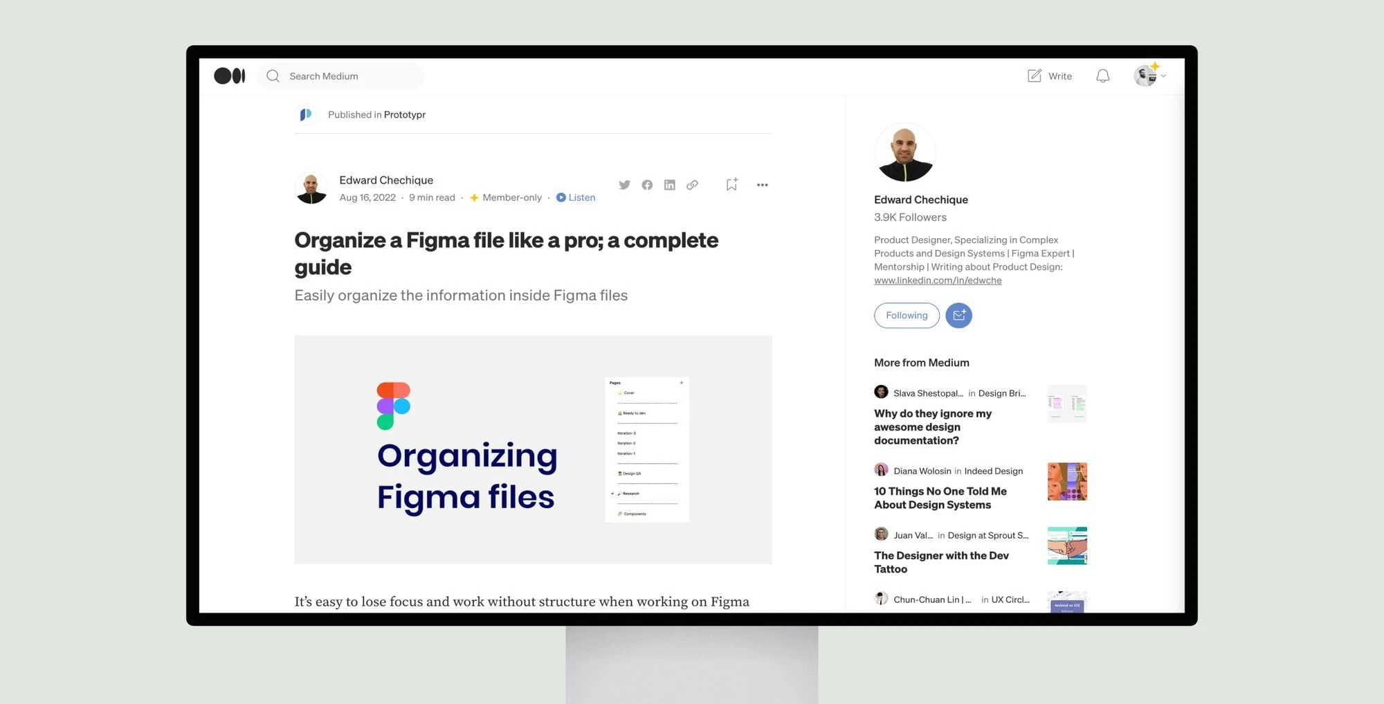
The article provides guidance on how to organize design files in Figma for efficient collaboration and workflow. It recommends structuring files with specific pages like a cover image, screens ready for development, iteration pages, research, design QA, components, and optional design decisions.
Each section is described in detail with tips. The cover image should identify the project and be easy to understand at a glance. The ready for development screens should be clean and built with components. Iteration pages show different designs tested. Research and inspiration content is included. Design QA findings are documented. New components can be placed on their own page.
Overall organization techniques like clear naming, using pages as separators, and creating templates are suggested. It emphasizes the importance of discussing the structure with the team. The goal is to make files easy to navigate and find information for all collaborators like designers, developers, and product managers.


