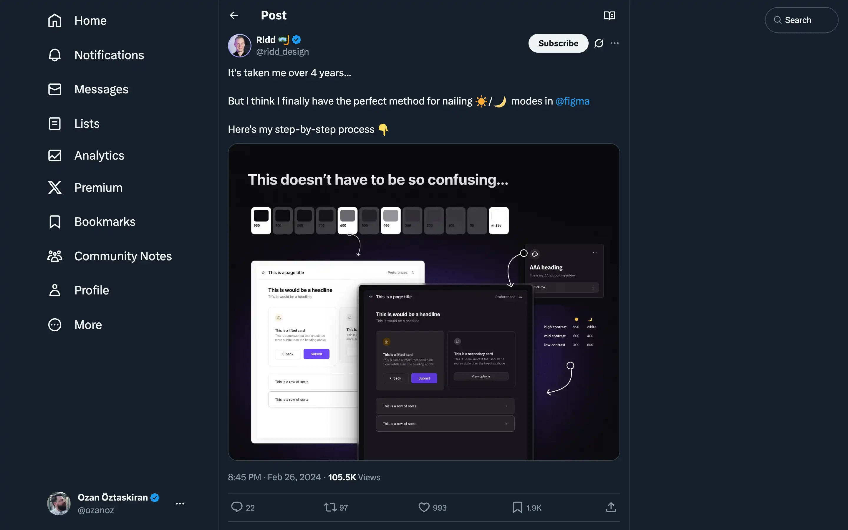
Ridd offers a comprehensive and insightful guide on creating the perfect light/dark mode design in Figma.
Ridd’s step-by-step approach emphasizes the importance of considering low and high contrast rather than just “light” and “dark” colors. The critical steps outlined include:
- Nailing the hue: Using the hue from the primary color to ensure the grays work well with the brand palette.
- Picking the saturation level: Maintaining a saturation range of roughly 1-20, with higher saturation for darker colors and lower saturation for lighter shades.
- Deriving the brightness values: Leveraging UI needs to determine the appropriate brightness values for a cohesive light/dark mode design.
Ridd’s expertise and attention to detail are evident throughout the post, making it a valuable resource for designers looking to master the art of creating seamless light/dark mode experiences in Figma.