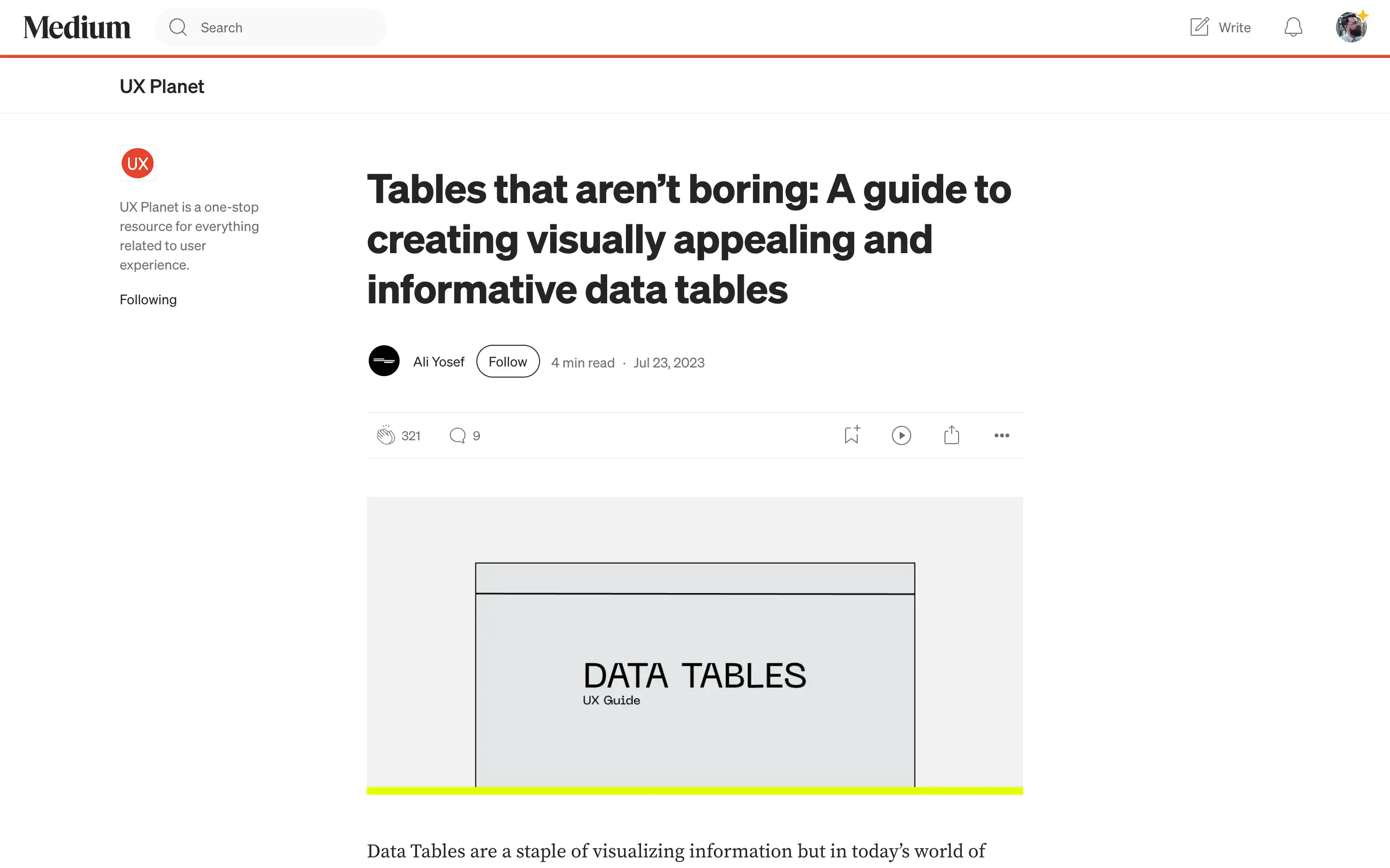
Tables are a fundamental tool for visualizing data, but they can often seem dull and static. This guide provides a comprehensive set of strategies for designing data tables that are visually appealing, functional, and engaging for users.
The key recommendations include horizontal lines, vertical scrolling with a subtle drop shadow, and aligning the first column’s style with the header cells during horizontal scrolling. Resizing columns to reveal cropped content, adding action buttons on hover in the last column, and leveraging color-coded status labels are also highlighted as effective techniques.
The guide also emphasizes the importance of considering the user’s needs and preferences, encouraging designers to make the experience “fun” by incorporating interactive elements and visuals. Following these principles, data tables can be transformed from mundane to captivating, fostering better user engagement and insights.


