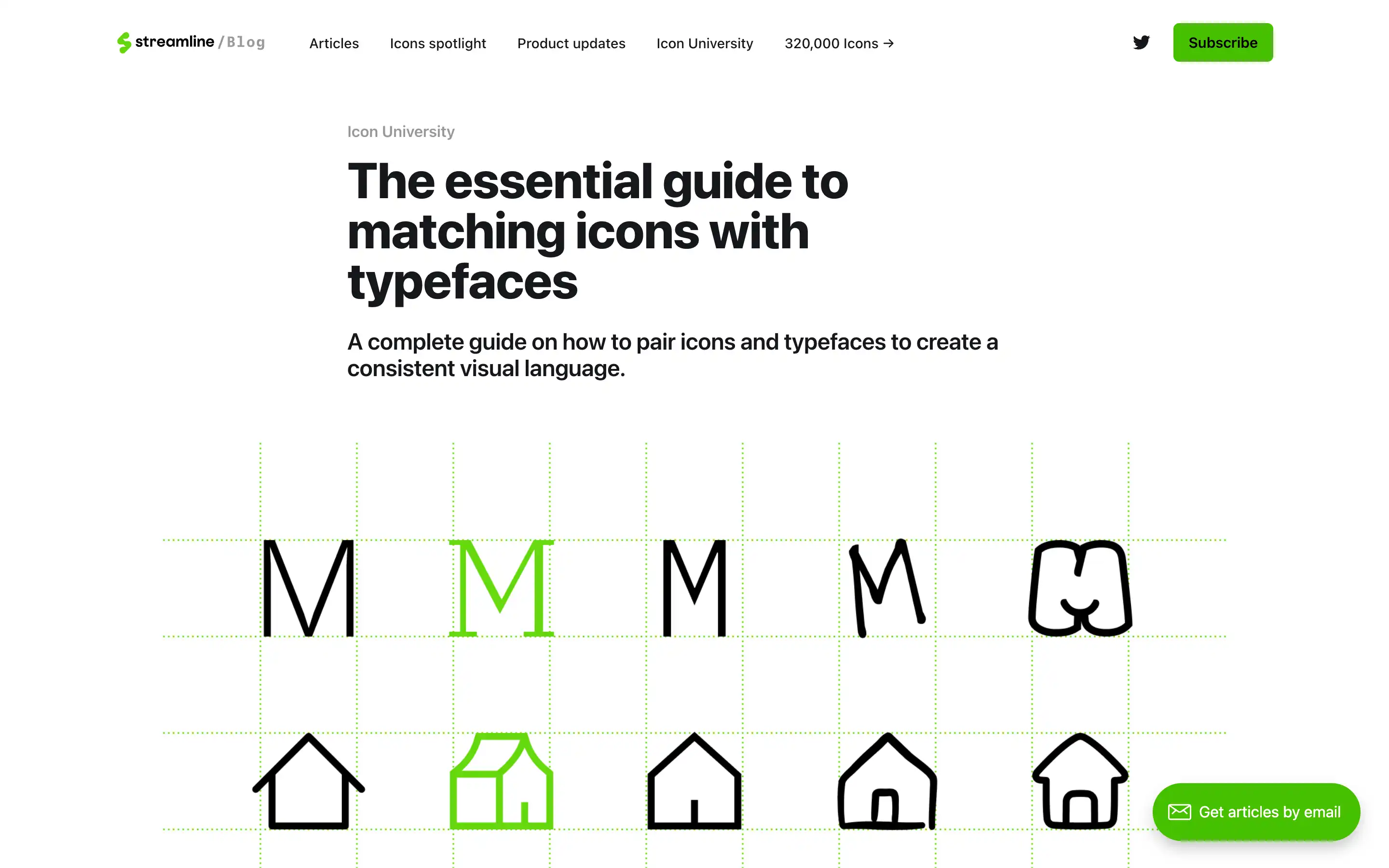
The article “The Essential Guide to Matching Icons with Typefaces” offers insights into selecting icons that complement specific typefaces, ensuring visual consistency across design projects. It emphasizes the importance of aligning the purpose, style, and scalability of both icons and typefaces to effectively convey the intended message.
The guide categorizes typefaces into groups such as sans serif, serif, and display, providing recommendations for pairing them with suitable icon styles. For instance, sans serif typefaces like Open Sans pair well with clean, modern icon sets like Ultimate, while serif fonts like Merriweather complement more detailed icon styles. This resource is valuable for designers seeking to create cohesive and harmonious visual identities by thoughtfully combining icons and typefaces.


