The article discusses the problems with using tooltips in user interface design and provides better alternatives. It argues that tooltips are inaccessible, obscure content, and require extra effort from users. Six specific issues are outlined, such as tooltips being hard to notice, requiring users to hover over elements, and not working for keyboard/touch users.
The author advocates doing more upfront work to simplify interfaces so additional explanations aren’t needed. Inline text or toggled additional content are presented as better solutions. Examples are given throughout to illustrate good and bad practices.
In summary, the page makes the case that tooltips impose unnecessary burdens and designers should find more inclusive ways to provide supplemental information to users.
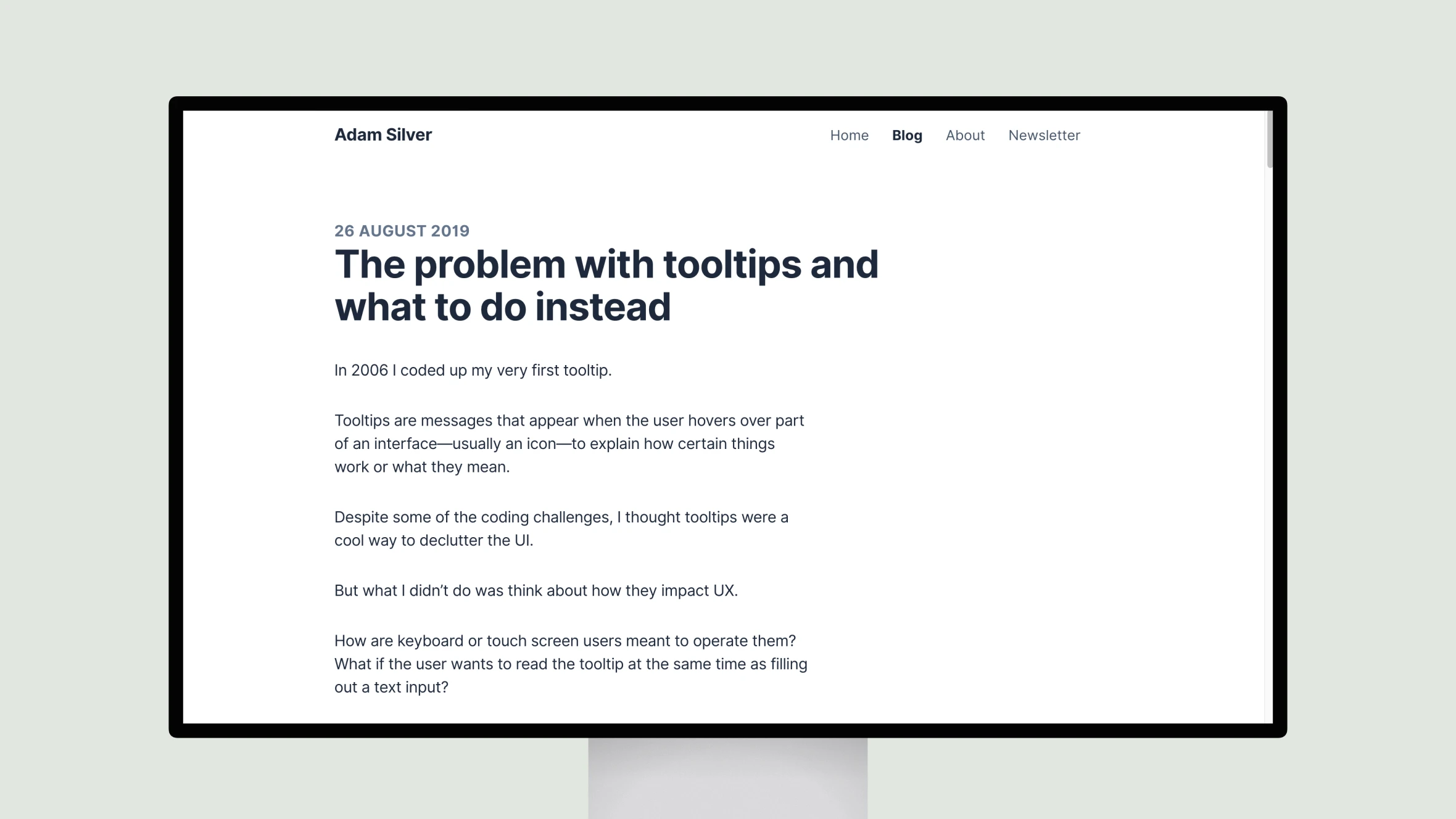
The problem with tooltips and what to do instead
Tooltips in UI design, suggesting inline text and toggled content as more accessible, user-friendly alternatives.
Topic(s):
Added on:
UI & UX design inspiration for mobile & web apps.

