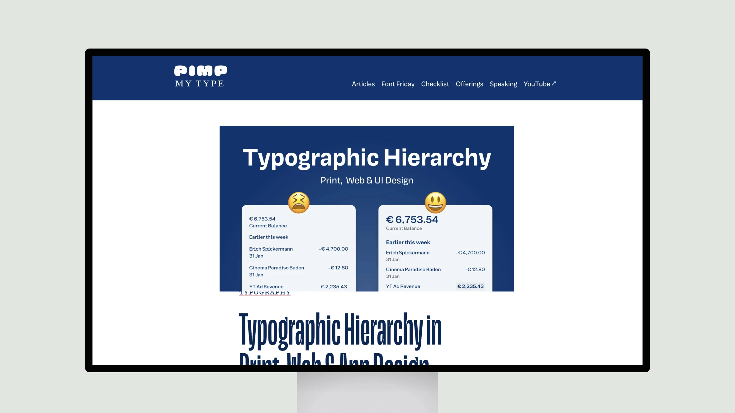
Oliver Lindberg discusses the importance of visual contrast and spacing in print, web, and app design. Through practical examples from documents, buttons, and banking app interfaces, Lindberg illustrates how to establish a clear visual hierarchy by varying type size, weight, and color. He emphasizes first establishing contrast between primary and secondary information, whether through bolder headings or higher color contrast on buttons.
Lindberg then shows how adjusting spacing can further accentuate relationships between elements and guide the eye. This practical guide provides useful techniques for any designer to create more scannable layouts and user interfaces through leveraging the fundamental principles of visual hierarchy. Lindberg’s concise yet detailed approach makes this an excellent resource for both experienced and junior designers.
Typographic Hierarchy in Print, Web & App Design
Oliver Lindberg’s guide explains how visual contrast and spacing enhance design hierarchy, improving scannability in print, web, and app interfaces.
Topic(s):
Added on:
UI & UX design inspiration for mobile & web apps.


