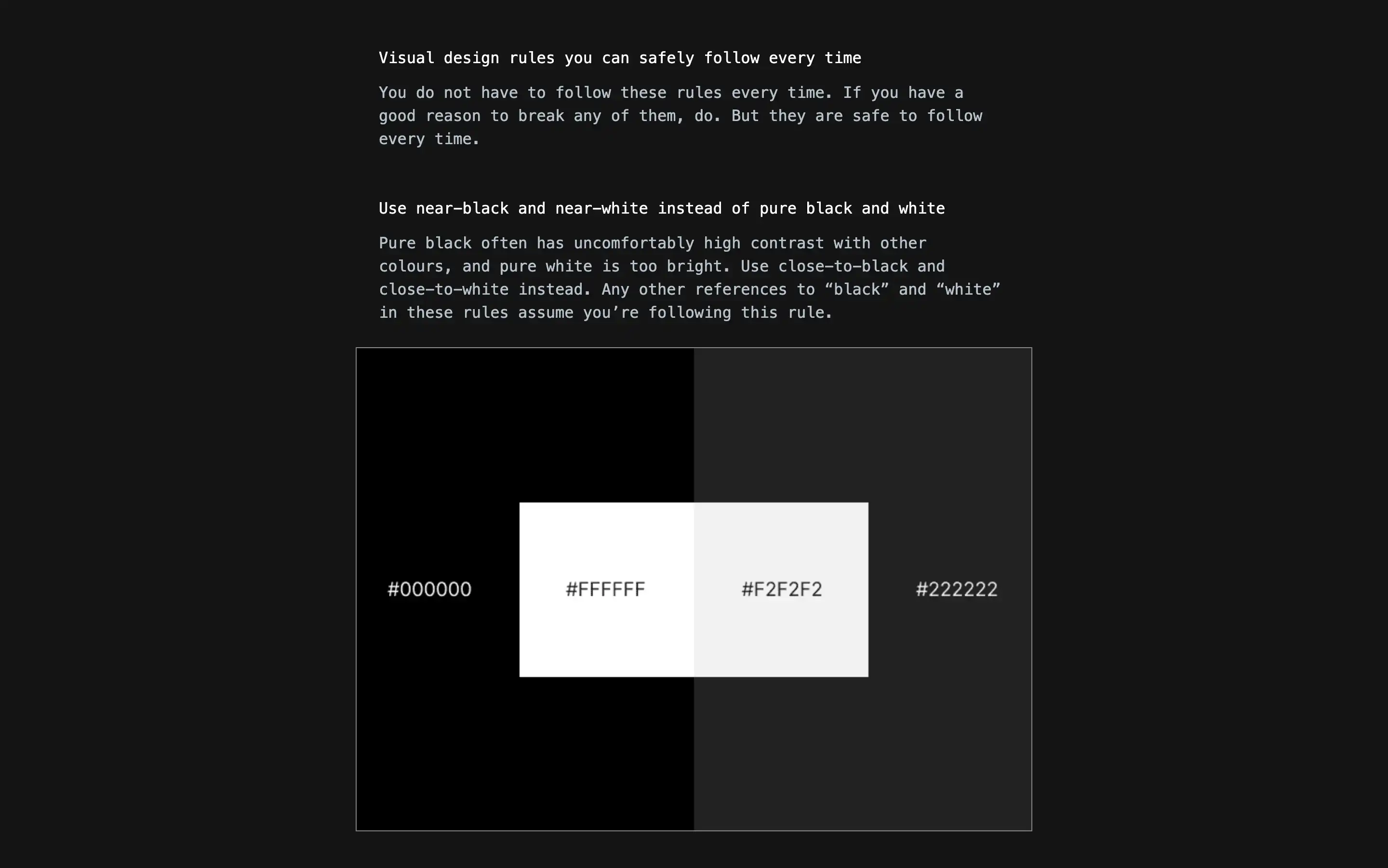
“Visual design rules you can safely follow every time” is a resource providing a comprehensive set of practical guidelines for achieving effective and visually coherent digital interfaces. The site, authored by Anthony Hobday, outlines foundational principles such as using near-black and near-white instead of pure black and white, saturating neutrals for a cohesive palette, and ensuring high contrast for important elements. It emphasizes the importance of deliberate decision-making in every aspect of design—from spacing and alignment to color choices and typography—encouraging designers to be intentional in their approach and to understand the rationale behind each visual choice.
The material groups related rules into logical themes, including color usage, alignment, spacing, typography, and depth, providing context and rationale for each. For example, it covers the benefits of optical over mathematical alignment, the importance of mathematically related measurements, and the value of consistent depth techniques. Each rule is supported by practical examples or explanations, ensuring that users understand not just what to do, but why it matters. The resource concludes that while these rules are safe defaults, thoughtful exceptions can lead to even better design outcomes, making it especially useful for designers seeking reliable starting points and a deeper understanding of visual design logic.


