World’s largest collection of design resources, curated by designers.
Subscribe for best weekly resources, freebies, and exclusive discounts from leading design brands.

Join 4.5k+ creators
Featured Goodness

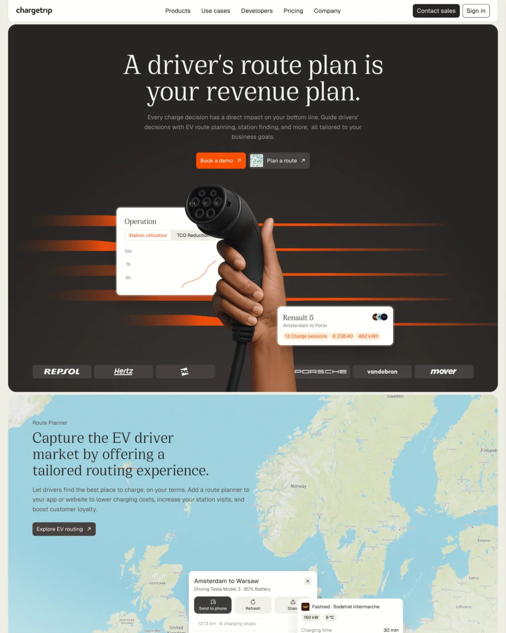
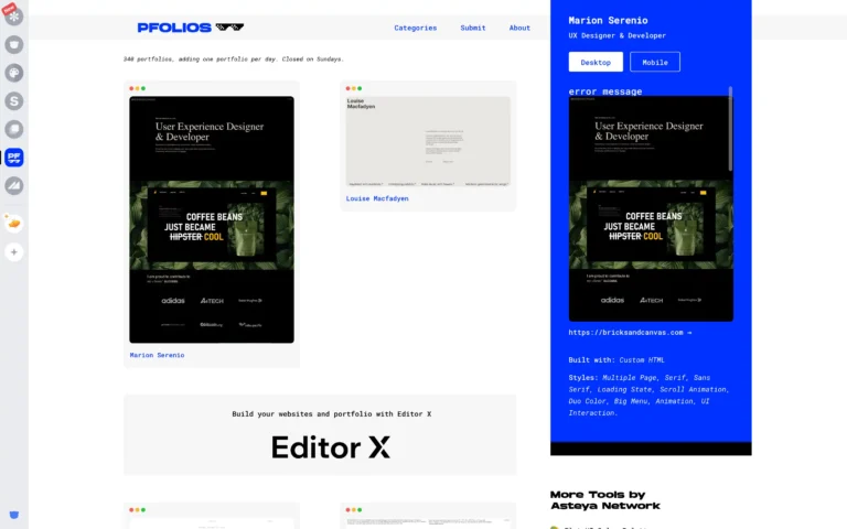
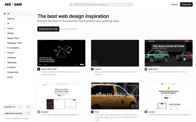
Website Inspiration
Best Web Design Inspiration + Figma Convert
Quick Tip: You can generate the layered Figma of the websites you browse.
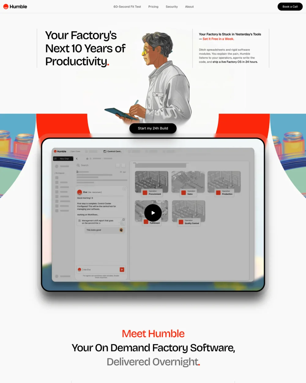

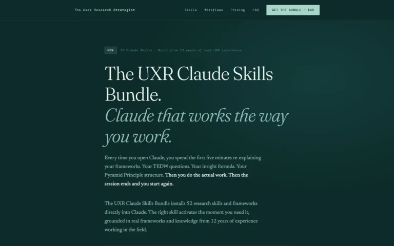
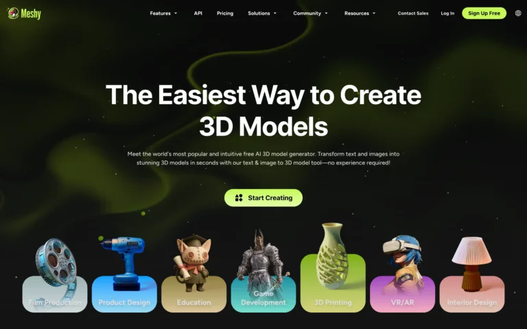
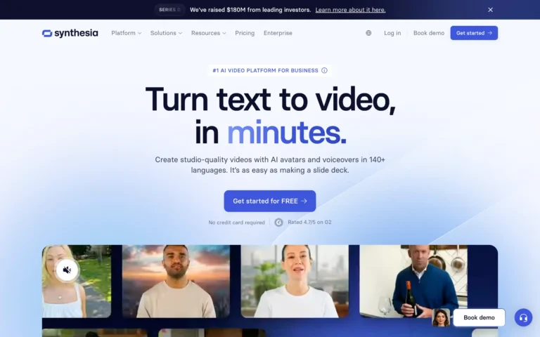
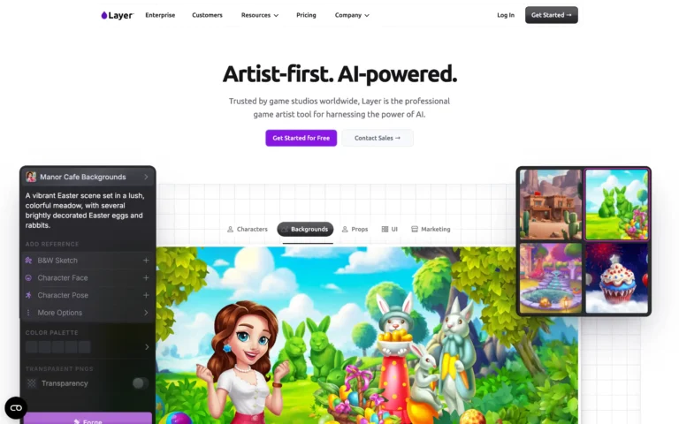
AI-Enhanced Design
Smart tools. Faster flows. Better work.

Free AI Resume Builder – Create ATS-Friendly Resumes


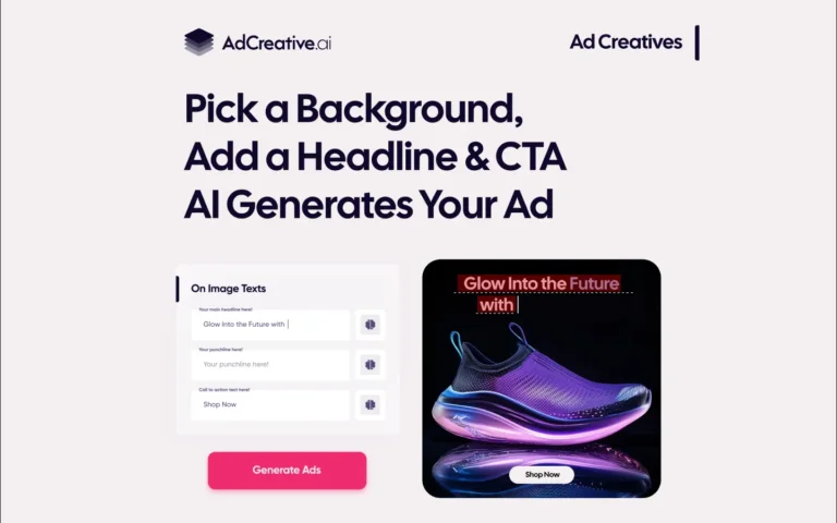
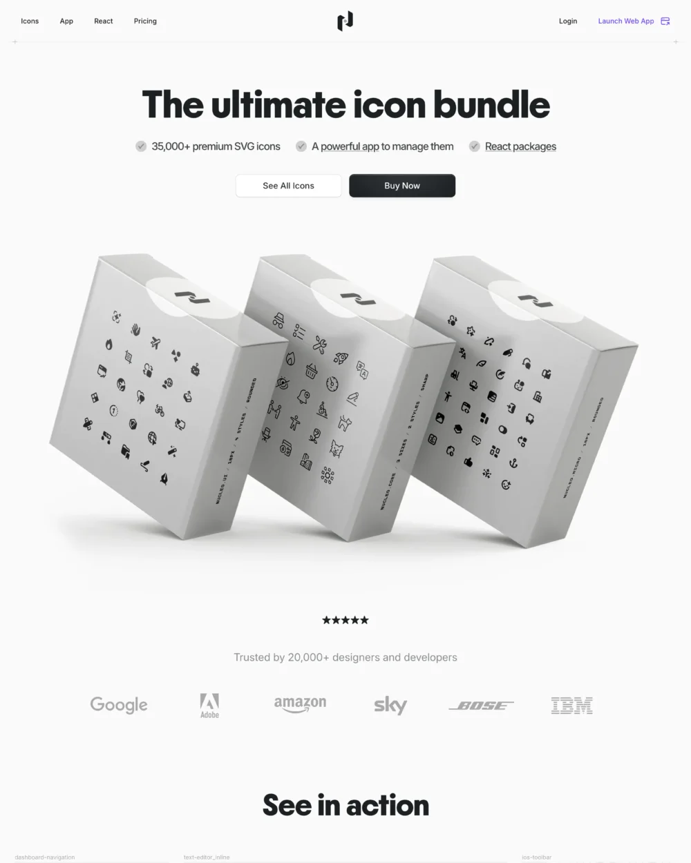
UI & Visual Design Essentials
Everything to make your design stand out.
The ultimate Figma UI kit and React component library.
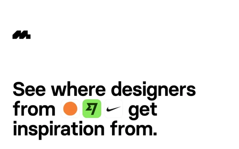
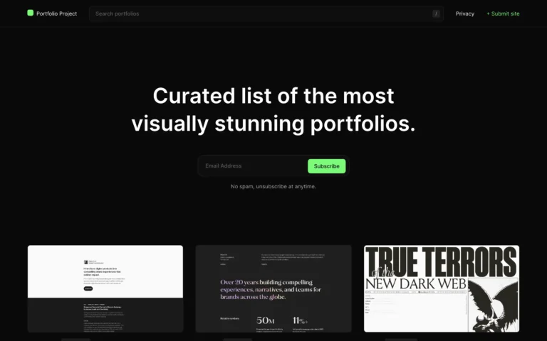
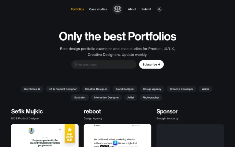
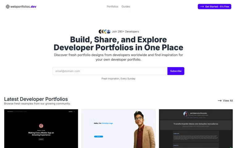
Design Inspiration
Visual references and interface ideas to spark your next project.
UI & UX design inspiration for mobile & web apps.

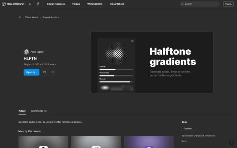
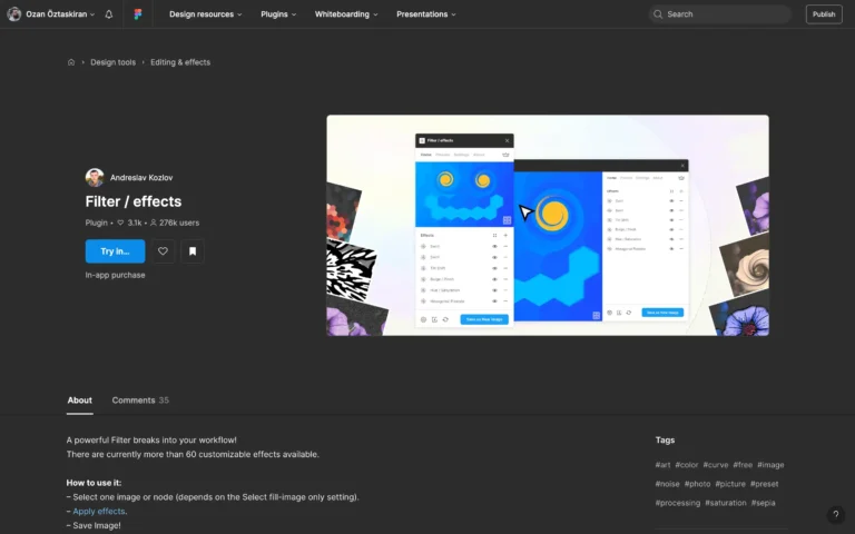
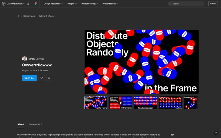
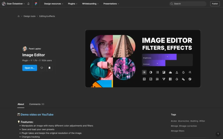
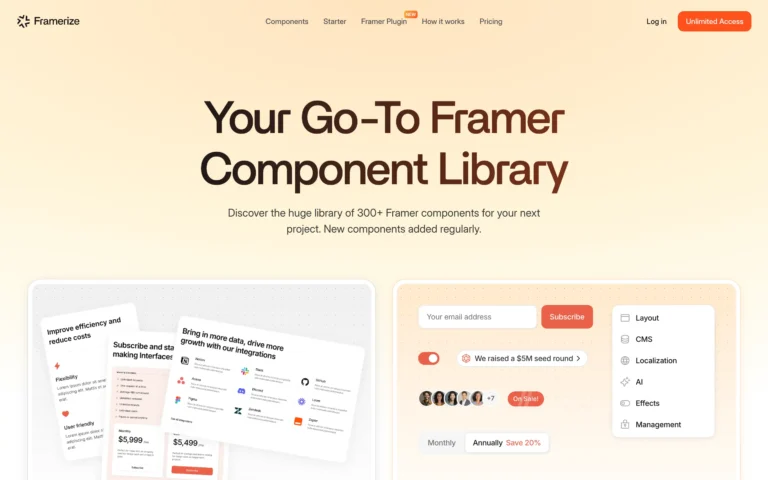
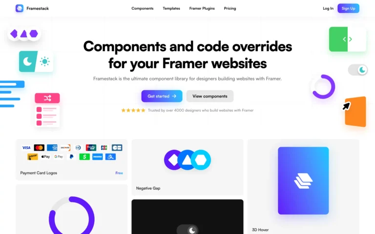
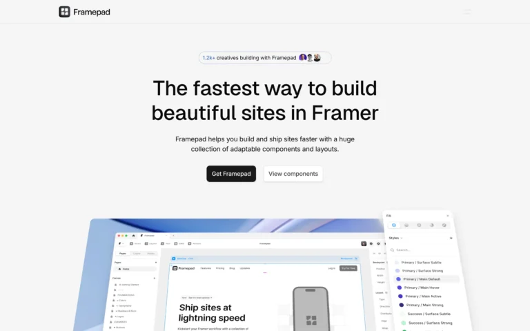
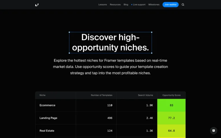
Figma Finds
Power tools for pixel pushers.
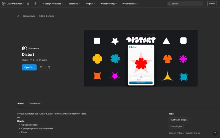
A growing family of 20+ plugins – 2.5 million users
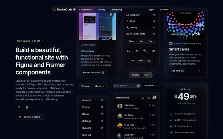
Framer by Fountn
Curated for designers who ship.

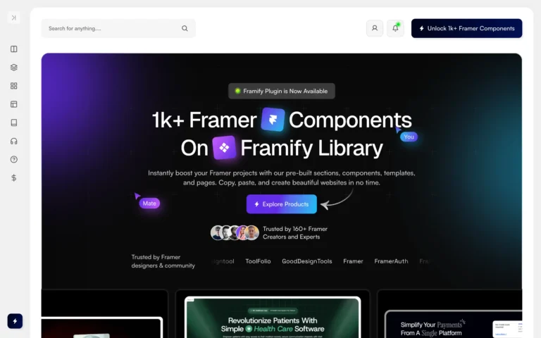
A Framer template that adapts to your style.
