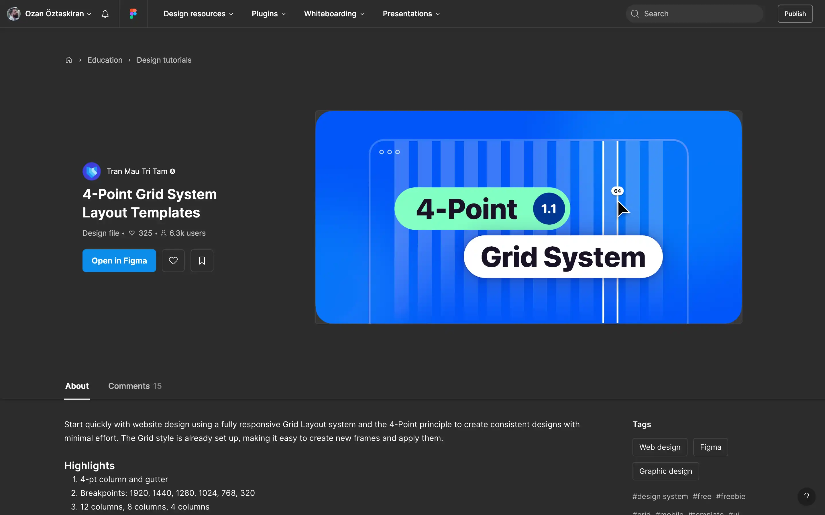
Start quickly with website design using a fully responsive Grid Layout system and the 4-Point principle to create consistent designs with minimal effort. The Grid style is already set up, making it easy to create new frames and apply them.
Highlights
- 4-pt column and gutter
- Breakpoints: 1920, 1440, 1280, 1024, 768, 320
- 12 columns, 8 columns, 4 columns
