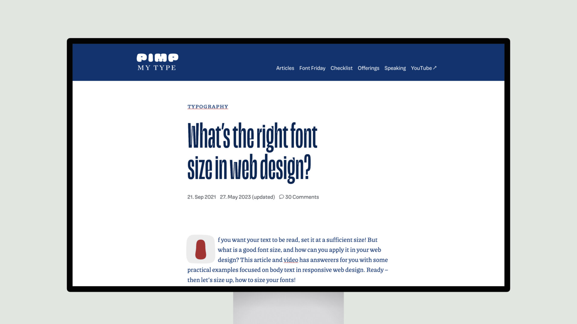
The article “What’s the right font size in web design?” provides guidelines for selecting appropriate font sizes for various text types in web design. It suggests starting body text at 16px (1em) and adjusting based on the device, recommending up to 24px (1.5em) for desktop and slightly smaller sizes for mobile. For display text, such as headings, it advises 40px (2.5em) by default, scaling between 32px (2em) on mobile and up to 64px (4em) on desktop. Functional text, like captions and navigation, is recommended between 12px to 14px (0.75em to 0.875em), with a maximum of 16px (1em) on desktop.
The resource emphasizes the use of relative units like em and rem for scalability and responsiveness. It also discusses the importance of adjusting font sizes relative to the viewer’s distance from the device, suggesting larger fonts for larger screens. Additionally, it highlights that the choice of typeface affects readability, noting that typefaces with larger x-heights may appear larger at the same size compared to those with smaller x-heights.

